article thumbnail

5 Key Strategies for Making Data Visualization Accessible

Dataversity

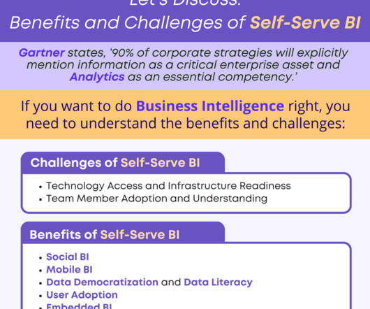
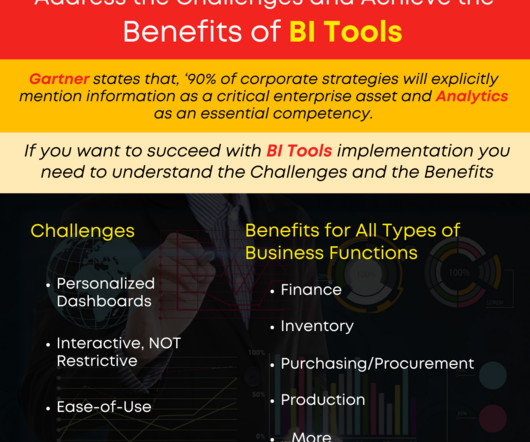
—Albert Einstein Research has found that 65% of the general population are visual learners, meaning they need to see information as images to understand it. The business world confirms this: Visualization is essential in driving success.

article thumbnail

Exploring Iris Data Visualization with Seaborn’s Violin Plot in Python

Analysts Corner

Introduction Data visualization is an essential skill for anyone who wants to explore and understand large datasets. One of the most popular libraries for data visualization in Python is Seaborn. In this article, we will focus on understanding how to use Seaborn’s violin plots to visualize the Iris dataset.

Insiders

Sign Up for our Newsletter

This site is protected by reCAPTCHA and the Google Privacy Policy and Terms of Service apply.

article thumbnail

Exploring Data Visualization in Three Steps

Dataversity

Data analytics has accompanied me for 15 years already. I started my career as a data analyst in a controlling department immediately following my graduation from the University of West Bohemia; I now work as a data scientist providing consultancy services for a range of different fields.

article thumbnail

A Complete Guide to Data Analytics

Astera

What Is Data Analytics? Data analytics is the science of analyzing raw data to draw conclusions about it. The process involves examining extensive data sets to uncover hidden patterns, correlations, and other insights. Data Mining : Sifting through data to find relevant information.

article thumbnail

Data Analytics Lifecycle Phases

The BAWorld

The Data Analytics Lifecycle is a diagram that depicts these steps for professionals that are involved in data analytics projects. The phases of the Data Analytics Lifecycle are organized in a circular framework, which is referred to as the Data Analytics Lifecycle. Click below to know more.

article thumbnail

Data Visualization in R | How to create Violine chart in R using ggplot2

Analysts Corner

In this article, we will explore how to create violin plots using the ggplot2 package in R. Getting Started: First, we need to install and load the ggplot2 package, which is an extension of the base R graphics system that allows for more flexible and customizable visualizations. height = 0.1, Thanking you very much for your time.

article thumbnail

What, Why, and How of Data Visualization

The BAWorld

Data Visualization. Did you know visualization has been in use since (and well before that as well) 1824 AD to develop an Egyptian map – the Turin Papyrus Map. Every data set tells us some story, but we need practical tools to find and communicate the story’s purpose with the stakeholders. About Techcanvass.