

10 Important Ways Data Visualization Can Benefit Your Content Strategy
Smart Data Collective
APRIL 7, 2022
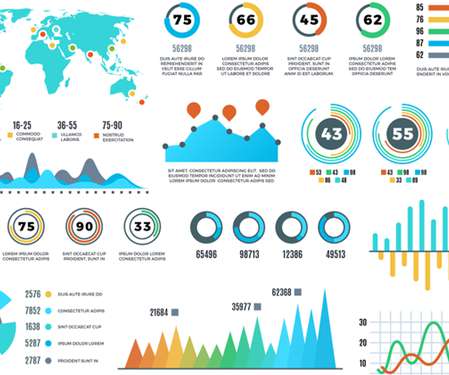
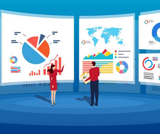
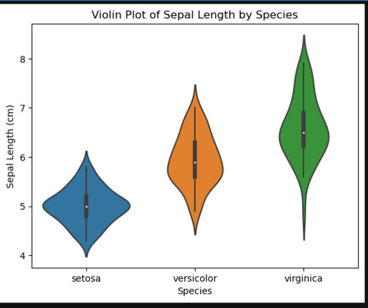
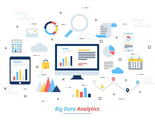
Data visualization has become a major part of life for those looking to make use of the large swathes of data available in the modern world. That’s where data visualization comes in. Data visualization is, to put it simply, converting hard data and lists of numbers or facts, into an easier to comprehend form.


Let's personalize your content