
Reflecting on a decade of data science and the future of visualization tools
Tableau
FEBRUARY 24, 2021
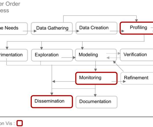
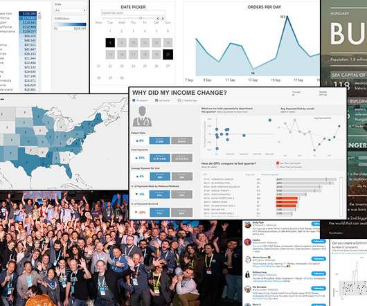
I presented these results in a research publication entitled “ Passing the Data Baton: A Retrospective Analysis on Data Science Work and Workers ”. Part of the motivation for this research was to serve as a foundation for research and development, so that I may identify areas where visual analytics tools might address an unmet need.


Let's personalize your content