Police Scorecard visualizes data on policing to drive for equity and change


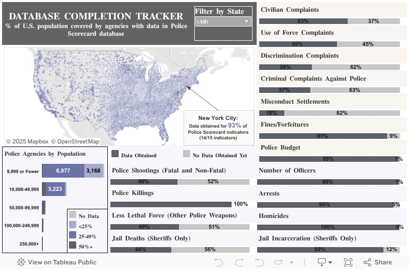
A dashboard showing the progress toward completion of the Police Scorecard dataset. Visualization credit: Police Scorecard
Last year, after Derek Chauvin murdered George Floyd, people and communities began to reckon with the reality of policing in America. As protests spread from Minneapolis to cities across the country and around the world, conversations about institutional racism within policing—and what can be done about it—spread with them.
But understanding the path to creating more equity in law enforcement is not easy. As many in the media and in the data community have pointed out, data on policing is often difficult to find and to work with. At the same time, good, comprehensive data on policing can play a pivotal role in illuminating where change is most needed, and the solutions that could have the greatest positive impact. As part of our Racial Equality and Justice Taskforce’s policy priorities, Salesforce supports accurate and transparent data collection as part of our police and criminal justice reform work.
Sam Sinyangwe, a data scientist, activist, and founder of Campaign Zero, decided to take action to make this data available and accessible. Sinyangwe developed and launched Police Scorecard, a comprehensive data resource on 13,147 police departments and 2,878 sheriffs departments that provides in-depth metrics on everything from police funding, to use of force, to racial bias in enforcement.
The underlying dataset for Police Scorecard is massive: over 13 million cells of data and counting. To provide a way into understanding it, Sinyangwe and his team relied on Tableau data visualizations to highlight key trends in the data. Several Tableau Ambassadors and Community members contributed to the effort to build the dataset and create the visualizations you see today on Police Scorecard. The platform, Sinyangwe says, will continue to evolve as more data is added to the underlying dataset, and more visualizations are built to explore trends and correlations across departments.
Police Scorecard is the first-ever platform of its kind. Because data on policing and outcomes in the US is often incomplete and varies in format from department to department, synthesizing it into one dataset was a complicated task—but the result is an indispensable resource designed to empower residents, advocates, and law enforcement agencies themselves to analyze their data and identify avenues for progress.
From the past year of working with Sinyangwe and the Police Scorecard team on this resource, we’d like to share about the data process behind it, and the ongoing role of data visualization in advancing the conversation.
How to understand Police Scorecard
At its core, Police Scorecard is designed as a tool to enable understanding of how policing functions in a city or jurisdiction—and how circumstances compare across cities.
On the Scorecard, each agency is given a percent score out of 100 that is based on how a city performs on six common principles, determined by the Police Scorecard team, for evaluating agency performance:
- The agency should prioritize addressing serious threats to public safety, not arresting or incarcerating people for low level offenses.
- The agency should avoid the use of force, especially deadly force, to the greatest extent possible.
- When people come forward to report misconduct by employees of the agency, it should result in some form of accountability.
- When people call on the agency to solve the most serious crimes—those resulting in death—they should be able to trust that agency to find the person responsible.
- The agency should accomplish these goals in ways that are not biased or discriminatory.
- The agency should accomplish these goals at the lowest cost possible, minimizing the financial burden on communities.
Agencies with lower scores are furthest from aligning with these principles, according to Police Scorecard.
Sinyangwe New Orleans as an example of how to relate the Scorecard to these principles. Overall, New Orleans scores a 46% on the Scorecard. Digging into the data, you can see that the municipal police agency scores far worse than comparable cities on key metrics related to police accountability, budget, and low-level arrests.

The complete Police Scorecard ranking for New Orleans Police Department. Credit: Police Scorecard
Looking at the data in the Scorecard, Sinyangwe says, is a way to understand where the greatest need for change is for specific agencies. It’s also a window into the efficacy of policing-related policies that have been implemented. He points to New York City, which passed legislation in 2016 intended to lower the number of arrests for low-level offenses. According to the Scorecard data, arrests have steadily declined since then. “We can start to look into whether these interventions make a difference or not,” he says.
Police Scorecard is unique in the breadth and depth of data it provides on policing. “There's no other place to actually understand what the outcomes are in a given city with regard to police use of force, police accountability, arrests, racial disparities,” Sinyangwe says. “None of the behavior of the police is being tracked and published in one place in a way that can be made sense of and tracked over time to actually hold city officials, legislators and police accountable.”
Building an essential, complex data set
To create a data resource that offers insights on the 15 indicators in the Scorecard across thousands of agencies, Sinyangwe and team had to lean on multiple sources to build the underlying dataset. They drew primarily from the FBI Uniform Crime Report, the Bureau of Justice Statistics’ Annual Survey of Jails, and the US Census Bureau’s Survey of State and Local Government Finances. To fill in missing information, they obtained data from local agency publications and media reports. Mapping Police Violence, another project of Sinyangwe’s that aims to provide a comprehensive record of killings by police, provided data on that metric. And finally, Sinyangwe and team filed multiple public records requests and scoured annual reports department open data sites for data on non-fatal use of force and misconduct complaints.
The resulting dataset, Sinyangwe says, “was extremely complex to build.”
Several volunteers from the Tableau Community, including Zen Master Bridget Cogley, assisted in compiling the dataset. “When you pull data from myriad sources, you have to calibrate for the different ways that it’s presented,” Cogley says. For example, when presenting data on policing outcomes, the populations that make up the jurisdictions for municipal police departments and county sheriffs offices may overlap, but need to be understood distinctly. (For example: Seattle Police Department and the King County Sheriff’s Department may cover some of the same population, but data on their specific outcomes—like the number of arrests each department oversees—can’t be conflated.)
There were also inconsistencies to contend with in the data that departments report or share. “For example, the Chicago Police Department published on their website that they made around 85,000 arrests in 2018. But then when you look at the data for the same year that they reported to the FBI’s Uniform Crime Report, you see around 78,000 arrests,” Sinyangwe says. “That’s what makes it so complex–even for one category, it’s difficult to arrive at a consistent report.”
Part of what the volunteers worked with Sinyangwe on was vetting, down to the data point, every discrepancy across categories for the different data sources within Police Scorecard. The goal was to arrive at the most accurate data for each metric for each city.
While Sinyangwe and team prioritize rigor in compiling and publishing the data, “the usefulness of this tool is not in figuring out whether there were 54,307 arrests in a year, or 54,309,” Sinyangwe says. “It’s in figuring out which areas of the country need the most urgent interventions, and what types of interventions people should be thinking about to address these core issues.”
The role of visualization
For Police Scorecard, Tableau and data visualization provided a powerful solution for gaining insights from such a massive data set.
“When you look at the data visualizations, it’s clear that there is a lot of work to do in virtually every city,” Sinyangwe says. “But there’s also a lot of variation: There are some areas that need more urgent interventions than others, and there are some areas that are actually making a lot of progress, where we should be asking questions about how they got there. They might be examples of what types of solutions should be scaled up and invested in.”
There are some areas that need more urgent interventions than others, and there are some areas that are actually making a lot of progress, where we should be asking questions about how they got there. They might be examples of what types of solutions should be scaled up and invested in.
 A dashboard showing police departments that arrest Black people at higher rates than white people. Visualization credit: Police Scorecard
A city like Raleigh, North Carolina is a good illustration. With an overall score of 62%, it scored number 9 in the scorecard rankings. Digging into the metrics reveals both potentially positive models and areas for improvement. In the “killings by police” category, Raleigh scores 92%, meaning that the local police department uses deadly force relatively less frequently than others. However, it scores just 22% when looking at racial disparities in the use of deadly force—meaning killings are more likely to be racially biased.
For Tableau Public Ambassador Michelle Frayman, who assisted in the creation of many of the dashboards on the platform, the possibility of seeing connections and interrelations between the various metrics in the Scorecard was a motivating factor. “You can start to see if different factors relate to each other—if a growth in police budget correlates to an increase in arrests, or if a decline in arrests tracks with a decline in racial disparities.”
An ever-expanding resource—and opportunities to engage
Police Scorecard is intended to continuously evolve. Under the Findings section, the team created a Tableau dashboard to track the completion of the dataset. Currency, it’s at 35% complete, due to substantial limitations in data availability resulting from state laws that restrict sharing records, or a lack of consistent departmental reporting.
To work toward filling these gaps, the team has created a form for researchers, journalists, officials, organizers and students to submit new data to the Scorecard.
Sinyangwe also hopes to grow the team of volunteer data scientists and researchers analyzing the vast dataset for the Scorecard. With a dataset this large, there are numerous opportunities for analysis and visualization work that highlights key issues, as well as solutions.
To learn more about opportunities to get involved, visit PoliceScorecard.org.
Learn more about Salesforce’s commitments to advance racial equity, and visit Tableau’s Racial Equity Data Hub to see more examples of data for justice.
Related Stories

Using data to drive conversations about climate change
 April 28, 2022

Leveraging data to improve forestry practices worldwide

Doing Good Data Means Doing No Harm
 December 13, 2021
Subscribe to our blog
Get the latest Tableau updates in your inbox.