
Have you nailed all the data visualization basics? Stuff like…
✅You know pie charts are bad except in certain specific use cases;
✅You can spot chartjunk from a mile away;
✅You confidently pick the right kind of chart based on what you want to emphasize in the data;
✅You use just the right amount of color to bring meaning, but not so much as to distract;
✅Labeling; ✅legends; ✅titles…
Those are important skills. But what does it take to get your visualizations to the next level? I want to share a collection of tips and tricks that differentiate a competently designed chart from a pro-level visualization.
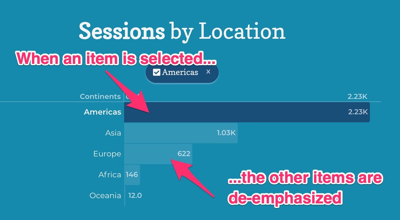
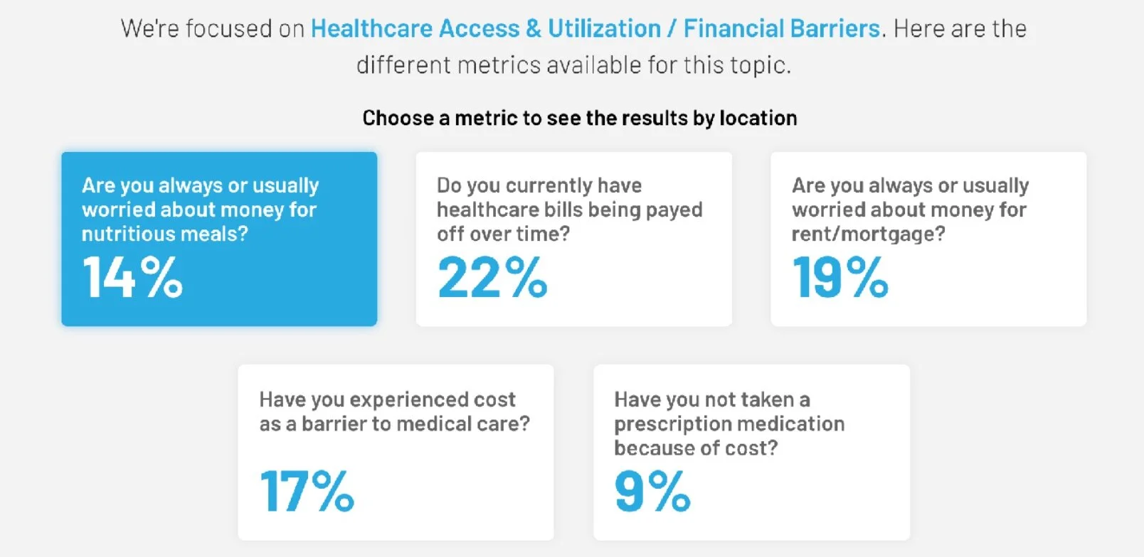
1. De-emphasize to manage attention
Emphasizing text and chart elements is good. Better: Combine emphasis of the most important things with de-emphasizing elements that don’t require as much attention. In the examples below, emphasized content gets more visual attention because other items or text is semi-transparent and therefore de-emphasized.

Beautiful.ai
Juicebox
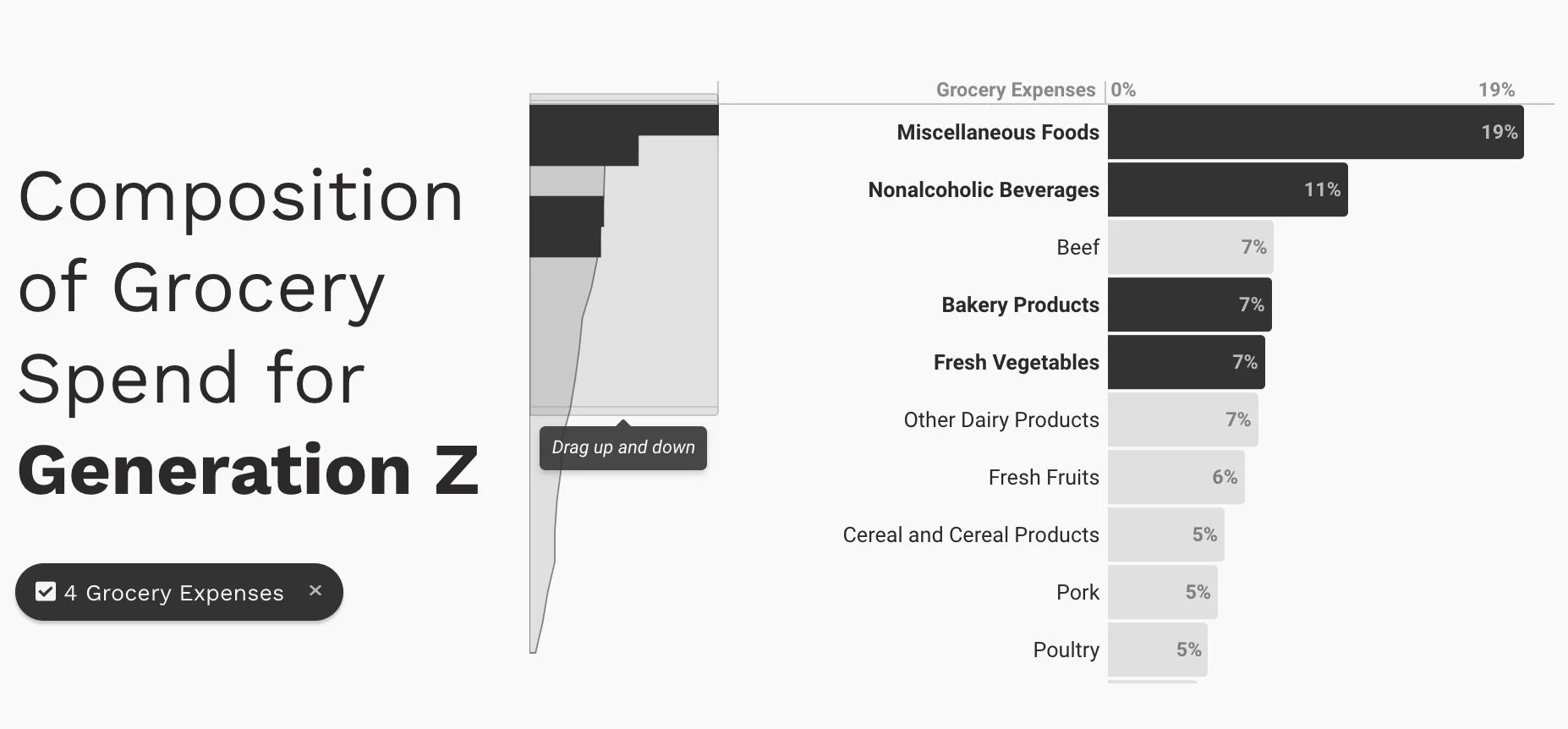
2. Points on a trend line
This one is a bit of a personal preference: I think it enhances a trend chart to explicitly show the individual points on the line. This has a couple of benefits: 1) It makes clear the frequency of the data points; 2) it is easier for users to select or interact with those points. The following examples have slightly different styles to displaying these points, achieving the same goal.

Juicebox

Ben Garratt, Dribbble
3. Label regions of visualizations
Many visualizations are displaying data positionally in 2-dimensional space. You can do your audience a favor by providing an explicit description of the meaning of different regions of that space. In this example, the reader can quickly determine the meaning of a point falling into one of the quadrants.

http://thedailyviz.com/2016/08/09/are-people-in-colder-countries-taller/
4. Use significant digit formatting on large numbers
When you are presenting data with large numbers, displaying these numbers can become cumbersome to the point of distraction. A better option is to shorten the number format by using a set number of significant digits. In Juicebox, we encourage using 3-significant digits so that

5. Bold colors with inverted text color
Readability in your data visualizations is critical. But shouldn’t preclude using bold, fully saturated colors as backgrounds. The answer is to flip the color of your text to maintain contrast in your designs. These examples show how inverted text colors can work alongside fun colors.

Juicebox

Juicebox
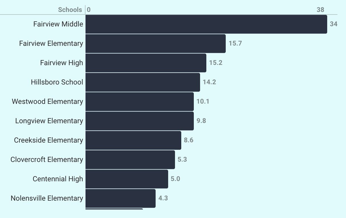
6. Elegant handling of many individual items
Most visualization types can easily handle 5 or 10 individual items. But what happens when your bar chart has 100 items? How do you show a map with 10,000 points? There are a few options depending on the scenario: 1) If there is a long tail of “smaller” values, they can be grouped in an “Other” category; 2) Use a hierarchy so the visualization only shows one level of detail at a time; 2) Create navigational mechanisms or pagination to avoid showing everything at once. Here is an example from Pro Publica:

https://projects.propublica.org/extinctions/
7. Few colors; good contrast
Beginning guides on data visualization focus a lot on the appropriate and restrained use of color. But there is less emphasis on contrast, color’s close cousin. Good use of contrast is necessary to make clear delineations between what is important or selected.
8. Horizontal labels
Labels are tricky little devils. Sometimes they can be too long or too small for easy readability. Expert data visualizers try to always display labels horizontally for easy reading and give them sufficient space so they don’t end up shrunk to small font sizes.
In the example on the left, both attempts to show these labels fail for the reader. In contrast, the chart on the right provides sufficient room by re-orienting the chart vertically.

https://www.pythoncharts.com/matplotlib/rotating-axis-labels/
Juicebox
9. Trend chart aspect ratios
There is research about the right aspect ratio for trend charts. The (mostly) accepted theory is “banking 45º”. From a Berkeley research paper:
William Cleveland demonstrates how the aspect ratio of a line chart can affect an analyst's perception of trends in the data. Cleveland proposes an optimization technique for computing the aspect ratio such that the average absolute orientation of line segments in the chart is equal to 45 degrees. This technique, called banking to 45 degrees, is designed to maximize the discriminability of the orientations of the line segments in the chart.
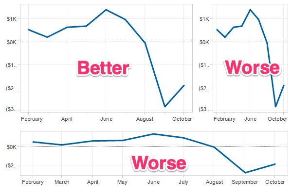
Eager Eyes: https://eagereyes.org/basics/banking-45-degrees
10. Drawing the link between the parts and the whole
Some of the best visualizations are able to represent individual things as part of the aggregate whole. It can be easy to abstract and aggregate data in a way that loses track of the individual pieces. This design approach is closely related to the concept that specificity is the soul of your data narrative.

https://guns.periscopic.com/?year=2013

Juicebox
These are the little things that take visualizations to the next level. It is the subtle bits that we try to build into Juicebox so you can look like a pro when you present data.


