Remove Blog Remove Data Visualization Remove Information Strategy Remove Visualization
article thumbnail

Understanding Data Drill Down And Drill Through Analysis And Their Role In Efficient Reporting

Data Pine

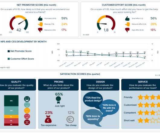
With this thought in mind, BI tools develop multiple solutions to assist businesses in dealing with their information in the most efficient way possible. From automated reporting, predictive analytics, and interactive data visualizations, reporting on data has never been easier. click to enlarge**. What Is Drill Through?

article thumbnail

A Guide To The Methods, Benefits & Problems of The Interpretation of Data

Data Pine

Capable of displaying key performance indicators (KPIs) for both quantitative and qualitative data analyses, they are ideal for making the fast-paced and data-driven market decisions that push today’s industry leaders to sustainable success. Exclusive Bonus Content: Download Our Free Data Analysis Guide.

Insiders

Sign Up for our Newsletter

This site is protected by reCAPTCHA and the Google Privacy Policy and Terms of Service apply.

article thumbnail

Uncover The Power Of White Label Dashboards & Reports With Key Features And Examples 

Data Pine

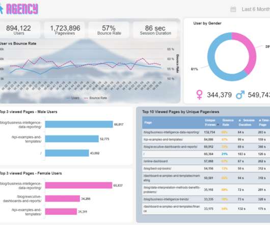
This is an especially valuable practice, especially considering that humans are visual creatures. Enhanced decision making : Relying on a white labeled report with all its analytical functionalities helps organizations generate informed strategies based on their own performance data.

article thumbnail

A Beginners Guide To The Power Of Area Charts – See Examples, Types & Best Practices 

Data Pine

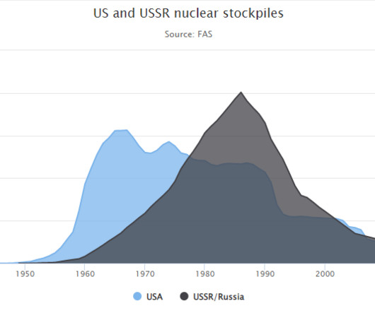
2) Types Of Area Charts 3) When To Use Area Graphs 4) Area Diagram Best Practices 5) Area Chart Examples It is no secret that the human brain processes visual information way faster than text or numbers. That is why graphical representations of data have been so popular in the media, politics, research, and businesses for decades.

article thumbnail

Uncover The Power Of Monitoring Dashboards With Examples, Templates, & Design Tips

Data Pine

For that purpose, you can take a look at our KPIs vs metrics blog post. Choose the right type of visual. Once you have defined the metrics and KPIs you want to portray, you need to define which types of data visualization you will use to do so. Use the 10-15 seconds rule. Benefit from interactive filtering options.