article thumbnail

Understanding Data Drill Down And Drill Through Analysis And Their Role In Efficient Reporting

Data Pine

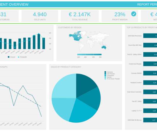
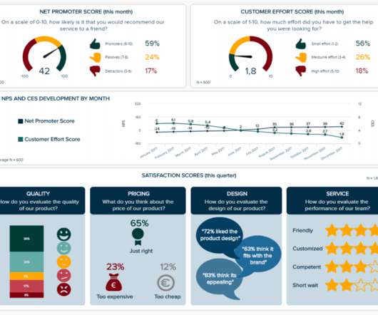
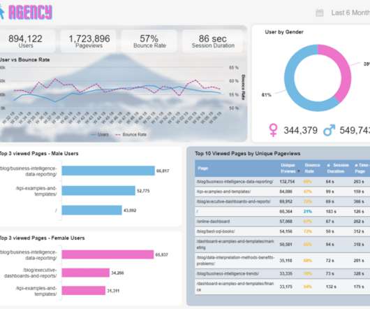
With this thought in mind, BI tools develop multiple solutions to assist businesses in dealing with their information in the most efficient way possible. From automated reporting, predictive analytics, and interactive data visualizations, reporting on data has never been easier. Our next example is from a table chart.

article thumbnail

A Guide To The Methods, Benefits & Problems of The Interpretation of Data

Data Pine

Powered by technologies such as artificial intelligence and machine learning, predictive analytics practices enable businesses to spot trends or potential issues and plan informed strategies in advance. Be respectful and realistic with axes to avoid misinterpretation of your data. 2) Use the right data visualization type.

Insiders

Sign Up for our Newsletter

This site is protected by reCAPTCHA and the Google Privacy Policy and Terms of Service apply.

article thumbnail

Uncover The Power Of White Label Dashboards & Reports With Key Features And Examples 

Data Pine

Enhanced decision making : Relying on a white labeled report with all its analytical functionalities helps organizations generate informed strategies based on their own performance data. For example, providing specific filters to explore the data based on users’ needs.

article thumbnail

A Beginners Guide To The Power Of Area Charts – See Examples, Types & Best Practices 

Data Pine

That being said, despite the prevalence of graphs and charts, there is still a lack of knowledge about the roles and uses of each data visualization type we have available. An area chart, also known as a mountain chart, is a data visualization type that combines the appearance of a line chart and a bar chart.

article thumbnail

Uncover The Power Of Monitoring Dashboards With Examples, Templates, & Design Tips

Data Pine

For that purpose, you can take a look at our KPIs vs metrics blog post. Choose the right type of visual. Once you have defined the metrics and KPIs you want to portray, you need to define which types of data visualization you will use to do so. Social Media Monitoring Dashboard.