
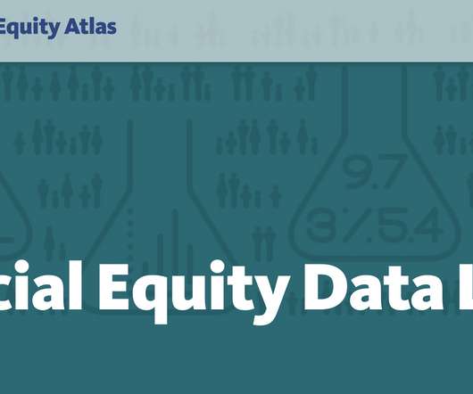
Introducing PolicyLink’s Racial Equity Data Lab: A new resource to support data for justice
Tableau
MAY 6, 2021
Our partners at PolicyLink launched their National Equity Atlas in 2014. Developed with USC’s Equity Research Institute , the Atlas is one of the most powerful resources for data on racial inequities in the country. The Lab is designed as a comprehensive data visualization resource for organizers working for racial equity and justice.


Let's personalize your content