
Data analytics has accompanied me for 15 years already. I started my career as a data analyst in a controlling department immediately following my graduation from the University of West Bohemia; I now work as a data scientist providing consultancy services for a range of different fields. The data analysis itself is the fun part. It provides a lot of valuable information to enable data-driven decisions. However, the most important step in the whole data analytics or data science process is communicating the results effectively.
1. Why Is Data Visualization Important?
Data visualization is a kind of new language that serves for communication within organizations across all levels “translating” the information the analyst has discovered from the data into a visual context that can be easily understood by the business user.
Today, everyone is talking about digital transformation, because across the world – especially the internet world – data is being generated. However, data itself does not help us. We have to convert it into something valuable.
We must build a big data environment that supports actionable business intelligence in a way that is easy to understand. Good data visualizations are key to showing insights and features that are difficult to point out in a raw table. They make it easier for users to detect patterns, trends, and outliers.
To summarize, here are the reasons why visualizing data is important:
- Understanding data
- Communicating results and information
- Extracting knowledge
- Telling a story
- Making data-driven decisions
There are common visualization principles we should always consider when creating the outputs:
- Know your audience
- Set your goals
- Select the right visualization type
- Simplify
- Emphasize
- Tell a story
2. Is My Data Unimodal, Bimodal, or Multimodal?
Now, let’s talk about different types of data visualization. The first split is based on the character of the data – if it is unimodal, bimodal, or multimodal.
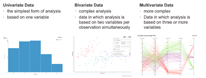
- Univariate analysis: Each variable is analyzed individually and we don’t look at more than one variable at a time. Univariate is used for the simplest form of analysis. It is the type of data in which analysis is made only based on one variable only
- Bivariate analysis: We analyze two variables to explore the association between them
- Multivariate analysis: Handles more than two variables and is for dealing with multi-dimensional data
3. Choose the Data Visualization Type
Another common split is based on visualization type. We can see three main categories:

Tables are a two-dimensional array-like structure in which each column contains values of one variable and each row contains one set of values from each column. Rows include observations and are always in a standard structure, where the structure is given by the columns, illustrating values of different features of each observation. Tables enable accurate searches of a certain value or values.
Charts illustrate data in graphs or plots. It’s very important to select the right visualization type. Here are the three most common types and charts:
- Evolution: Shows how a certain series develops with respect to a second quantity – line plot, area chart, bar chart (vertical)
- Distribution: enables to illustrate how the data is distributed and compare data to learn how they differ from each other – bar chart, histogram, box plot, violin plot, statistical indicators
- Relation: shows (the strength of) a relationship between two variables – scatter plot, heatmap, bubble chart
Dashboards contain different visualizations. They are interactive and the dashboard should be sharable via some internal server.
When we have completed the data analysis results, we need to ask ourselves, “How should I present them?” Very often, people just take a screenshot of the charts and present them via PowerPoint presentation, or even worse – a PDF.
The problem here is that this is a static representation of the results and they cannot be presented in real time. We can only show the past. Today, it is important to have the data and results available now and present them in real time.
Run as a Web Application
When we run our visualizations as a web application we are able to have the data and the results available immediately and present in real time. The KNIME ecosystem enables this via the WebPortal.
The WebPortal enables sharing the data visualization results within the component and its Composite View and thus brings users a workflow available as a web application that is
- Simple to read as a single web page
- Interactive
- Customizable to match corporate design
Before deploying the dashboard of different visualizations to the WebPortal, we need to understand an important feature: the component.
What is a component? Components are nodes to bundle functionality with their own configuration and composite views. Similar to “metanodes,” components are containers of a part of your workflow to build cleaner and structured workflows with the big difference being that the purpose of the components is also to share and then reuse as a template and make them accessible via custom interactive composite views.
The composite view serves for laying out interactive dashboards that can be shared in the WebPortal as a web application. The layout for the composite view is built in an opened component and can be set up as a:
- Basic layout
- Visual layout
- Advanced layout
The dashboard is available in the Analytics Platform as an interactive view of the component. The final dashboard can be deployed to the Server and then shared via the WebPortal as a web application with your team. Below you can see the composite view in Fig. 5. The next screenshot in Fig. 6 shows this composite view as a dashboard displayed via the WebPortal.


As first published on the KNIME Blog.