Logarithmic Confusion
We typically think of quantitative scales as linear, with equal quantities from one labeled value to the next. For example, a quantitative scale ranging from 0 to 1000 might be subdivided into equal intervals of 100 each. Linear scales seem natural to us. If we took a car trip of 1000 miles, we might imagine that distance as subdivided into ten 100 mile segments. It isn’t likely that we would imagine it subdivided into four logarithmic segments consisting of 1, 9, 90, and 900 mile intervals. Similarly, we think of time’s passage—also quantitative—in terms of days, weeks, months, years, decades, centuries, or millennia; intervals that are equal (or in the case of months, roughly equal) in duration.
Logarithms and their scales are quite useful in mathematics and at times in data analysis, but they are only useful for presenting data on those relatively rare cases when addressing an audience that consists of those who have been trained to think in logarithms. With training, we can learn to think in logarithms, although I doubt that it would ever come as easily or naturally as thinking in linear units.
For my own analytical purposes, I use logarithmic scales primarily for a single task: to compare rates of change. When two time series are displayed in a line graph, using a logarithmic scale allows us to easily compare the rates of change along the two lines by comparing their slopes, for equal slopes represent equal rates of change. This works because units along a logarithmic scale increase by rate (e.g., ten times the previous value for a log base 10 scale or two times the previous value for a log base 2 scale), not by amount. Even in this case, however, I would not ordinarily report to others what I’d discovered about rates of change using a graph with a logarithmic scale, for all but a few people would misunderstand it.
I decided to write this blog piece when I ran across the following graph in Steven Pinker’s new book Enlightenment Now:

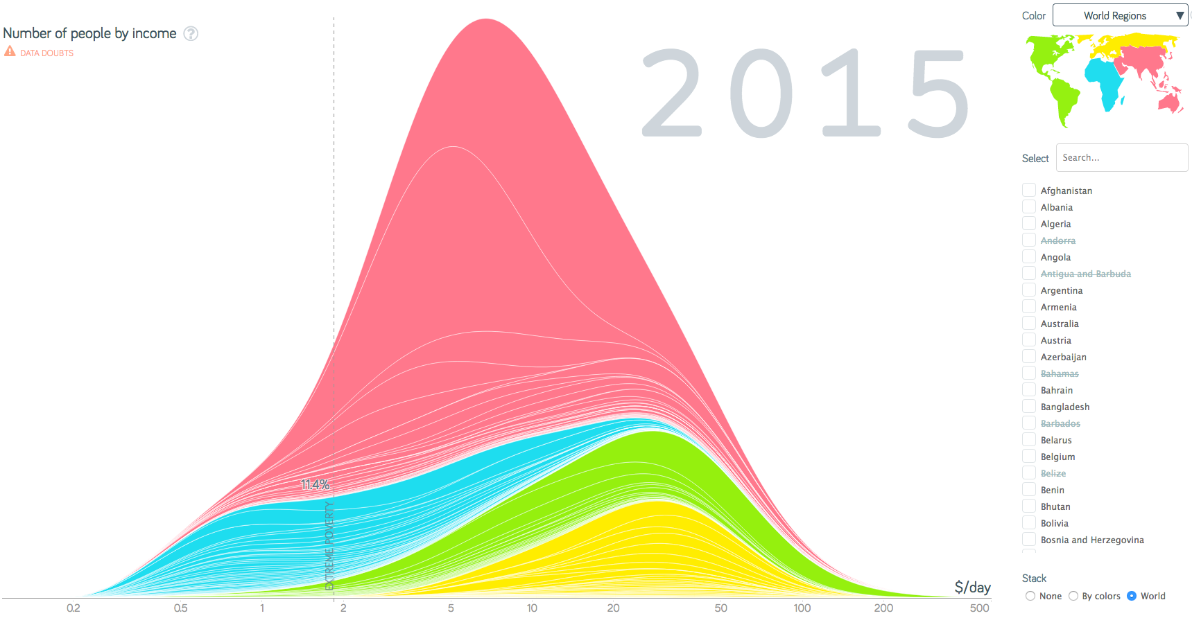
The darkest line, which represents the worldwide distribution of per capita income in 2015, is highlighted as the star of this graph. It has the appearance of a normal, bell-shaped distribution. This shape suggests an equitable distribution of income, but look more closely. In particular, notice the income scale along the X axis. Although the labels along the scale do not consistently represent logarithmic increments—odd but never explained—the scale is indeed logarithmic. Had a linear scale been used, the income distribution would appear significantly skewed with a peak nearer to the lower end and a long declining tail extending to the right. I can think of no valid reason for using a logarithmic scale in this case. A linear scale ranging from $0 per day at the low end to $250 per day or so at the high end, would work fine. Ordinarily, $25 intervals would work well for a range of $250, breaking the scale into ten intervals, but this wouldn’t allow the extreme poverty threshold of just under $2.00 to be delineated because it would be buried within the initial interval of $0 to $25. To accommodate this particular need, tiny intervals of $2.00 each could be used throughout the scale, placing extreme poverty approximately within the first interval. As an alternative, larger intervals could be used and the percentage of people below the extreme poverty threshold could be noted as a number.
After examining Pinker’s graph closely, you might be tempted to argue that its logarithmic scale provides the advantage of showing a clearer picture of how income is distributed in the tiny $0 to $2.00 range. This, however, is not its purpose. Even if this level of detail regarding were relevant, the information that appears in this range isn’t real. The source data on which this graph is based is not precise enough to represent how income in distributed between $0 and $2.00. If reliable data existed and we really did need to clearly show how income is distributed from $0 to $2.00, we would create a separate graph to feature that range only and that graph would use a linear scale.
Why didn’t Pinker use a linear scale? Perhaps it is because the message of the graph would reveal a dark side that would somewhat undermine the message of his book that the world is getting better. Although income has increased overall, the distribution of income has become less equitable and this pattern persists today.
When I noticed that Pinker derived the graph from Gapminder and attributed it to Ola Rosling, I decided to see if Pinker introduced the logarithmic scale or inherited it in that form from Gapminder. Upon checking, I found that Gapminder’s graphs of wealth distribution indeed feature logarithmic scales. If you go to the part of Gapminder’s website that allows you to use their data visualization tools, you’ll find that you can only view the distribution of wealth logarithmically. Even though some of Gapminder’s graphs provide the option of switching between linear and logarithmic scales, those that display distributions of wealth do not. Here’s the default wealth-related graph that can be viewed using Gapminder’s tool:
This provides a cozy sense of bell-shaped equity, which isn’t truthful.
To present data clearly and truthfully, we must understand what works for the human brain and design our displays accordingly. People don’t think in logarithms. For this reason, it is usually best to avoid logarithmic scales, especially when presenting data to the general public. Surely Pinker and Rosling know this.
Let me depart from logarithms to reveal another problem with these graphs. There is no practical explanation for the smooth curves that they exhibit if they’re based on actual income data. The only time we see smooth distribution curves like this is when they result from mathematical calculations, never when they’re based on actual data. Looking at the graph above, you might speculate that when distribution data from each country was aggregated to represent the world as a whole, the aggregation somehow smoothed the data. Perhaps that’s possible, but that this isn’t what happened here. If you look closely at the graph above, in addition to the curves at the top of each of the four colored sections, one for each world region, there are many light lines within each colored section. Each of these light lines represents a particular country’s distribution data. With this in mind, look at any one of those light lines. Every single line is smooth beyond the practical possibility of being based on actual income data. Some jaggedness along the lines would always exist. This tells us that these graphs are not displaying unaltered income data for any of the countries. What we’re seeing has been manipulated in some manner. The presence of such manipulation always makes me wary. The data may be a far cry from the actual distribution of wealth in most countries.
My wariness is magnified when I examine wealth data of this type from long ago. Here’s Gapminder’s income distribution graph for the year 1800:

To Gapminder’s credit, they provide a link above the graph labeled “Data Doubts,” which leads to the following disclaimer:
Income data has large uncertainty!
There are many different ways to estimate and compare income. Different methods are used in different countries and years. Unfortunately no data source exists that would enable comparisons across all countries, not even for one single year. Gapminder has managed to adjust the picture for some differences in the data, but there are still large issues in comparing individual countries. The precise shape of a country should be taken with a large grain of salt.
I would add to this disclaimer that “The precise shape of the world as a whole should be taken with an even larger grain of salt.” This data is not reliable. If the data isn’t reliable today, data for the year 1800 is utterly unreliable. As a man of science, Pinker should have made this disclaimer in his book. The claim that 85.9% of the world’s population lived in extreme poverty in 1800 compared to only 11.4% today makes a good story of human progress, but it isn’t a reliable claim. Besides, it’s hard to reconcile my reading of history with the notion that, in 1800, all but 14% of humans were just barely surviving from one day to the next. People certainly didn’t live as long back then, but I doubt that the average person was living well below the threshold of extreme poverty as this graph suggests.
I’ve grown concerned that the recent emphasis on data storytelling has led to a reduction in clear and accurate truth telling. When I was young, to say that someone “told stories” meant that they made stuff up. This negative connotation of storytelling describes a great deal of data storytelling today. Encouraging people to develop skills in data sensemaking and communication should focus their efforts on learning how to discover, understand, and tell the truth. This is seldom how instruction in data storytelling goes. The emphasis is more often on persuasion than truth, more on art (and artifice) than science.
8 Comments on “Logarithmic Confusion”
I’d suggest we need a new word added to the lexicon – the meaning of the word would be “not telling the truth, without lying”.
I’ve noticed people have gotten quite adept at it, whatever it is called.
“Lies, Damned Lies and Statistics”
People do think slightly logarithmic, you probably know all the street names near your home, the neighbouring towns and villages, some of the towns in neighbouring counties, some of the capitols in neighbouring countries…
Robert,
It isn’t obvious that this qualifies as logarithmic thinking. You need to explain this. Also, if it does in some manner qualify as logarithmic thinking, you should further explain how this applies to an understanding of graphs with logarithmic scales.
More on Pinker’s book:
https://www.resilience.org/stories/2018-05-18/steven-pinkers-ideas-about-progress-are-fatally-flawed-these-eight-graphs-show-why/
I live in a country where the average income is less than $2000 per year or $6 per day. Since this is the average, many have a lot less. This means many people struggle, but the standard of living is not that low by US standards.
Unlike the USA, not everybody in work can afford a car, but everybody has electricity, almost everybody has mains water and natural gas. Sewage is provided in every city. Food is plentiful and cheap – In a nice restaurant in the city a filet mignon with 30oz of beer and an desert is about $USD 5 to $USD 8. Much less outside the city. You can eat basic food in a cheap but nice restaurant for a dollar or a dollar fifty.
I believe there are proportionally more homeless people in the USA. You see people on many streets in the USA holding up signs for help or asking for for work. Here, only a very few old ladies beg, mostly because they find it surprisingly lucrative. Of course, most have too much pride to do it.
So you can’t make a linear comparison between incomes in the USA and the rest of the world. There are plenty of people in the USA struggling on $2,000 a week before tax to pay for their kid’s college. So your linear scale exaggerates the problem just as the log scale tends to reduce it. You also see many more children here. Partly because we are more family orientated women get married younger just as they did in the USA years ago, but also because People can afford them more easily than in the USA with its heavy taxes and high cost of housing.
Paul,
A linear scale does not exaggerate the differences. It presents the differences accurately and understandably. You might certainly argue that a particular data set does not accurately represent differences in measures of wealth between your country and others (e.g., due to errors, a unit of measure that isn’t comparable, or missing context), but you cannot validly argue that a linear scale exaggerates differences between the values. In other words, if people perceive differences to an exaggerated degree, which might indeed be the case, the problem was not caused by the linear scale.
Stephen, Thanks for your reply. I’m honored!
I only made my point because you used comparative earnings across the world.
A linear scale to measure tons of wheat or steel produced of the same grade and quality per capita is one thing, but I think per capita incomes are more complex.
Consider two US citizens in full-time work earning $20,000 and $150,000 respectively before tax. I don’t live in the USA so I am only imagining how it might be.
For the sake of illustration, the first is aged 18 and lives at home with their parents both of whom are successful movie actors, the $20,000 might be free money to them. They drive one of daddy’s or mummy’s spare cars depending on the day, mummy or really mummy’s staff feeds them and buys their clothes and and mummy’s bank pays their credit card every month automatically – nobody sees the statement. I don’t know much about the US tax system but our ‘imagined’ ‘low income’ 18 year may not pay a penny in income tax.
The “rich” guy on $150,000 per year might live in NYC with a huge monthly mortgage, pay a lot of tax to NYC, NY state and Uncle Sam, have a stressful dirty job, working long hours fixing other peoples cars, a wife who can’t work due to mental illness, inadequate medical coverage and two kids in a not very good but still expensive college.
Putting their “incomes” on the same linear or logarithmic scale is unlikely to tell a very actuate story about their available spending power or standard of living because other “factors” are not held constant.
So my point was “Charts purporting to show income differences” are fraught with problems whatever the scale.
Paul,
What you wrote in your most recent comments is quite different from what you said in your original comments. Originally, you argued that the linear scale created problems of comparisons, which is not the case. What you’re now arguing is indeed true. Comparisons of wealth among multiple countries are complex and fraught with challenges. Adjustments must be made to the values to make them comparable, which is difficult. With this I readily agree.