Data has become ubiquitous throughout culture and communication. It’s how we track health and wellness from our wearables, enjoy recommended music and movies, and — especially in marketing — report on the performance and effectiveness of campaigns.
What makes all these functions possible is the abundance of data. And while this proliferation certainly powers our lives in ways we appreciate, it can also be overwhelming to communicate to an audience.
What Is Data Visualization?
Data visualization is the process of creating visual assets to represent data, making it easier to visualize and understand the information. Bars, charts, and graphs are common ways to approach data visualization. Modern examples include icons, graphics, and infographics.
Data visualization in marketing is frequently used in reports, white papers, and case studies, as well as website content, social media, and email marketing.
Data Visualization in Marketing to Inspire You
Whether you have storehouses of data you want to communicate, or a smaller amount of information that’s complex and finicky, you can alleviate the burden on your readers by creating simple, easy-to-digest visuals to represent it.
Here are a few examples of data visualization in marketing to get you thinking.
How Americans Eat
Infographic
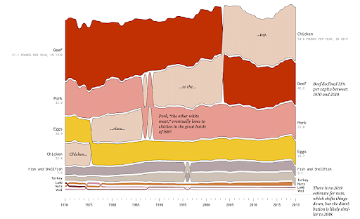
With the knowledge the U.S. government has been tracking food availability from 1970 on, this designer got super creative with the data. In this infographic, he used design to illustrate how the proteins Americans consume have changed over the years. Not only does it make learning the information more interesting, but the visual is incredibly compelling. It makes you want to look closer and learn.
World Vision
Global Water, Sanitation, and Hygiene (WASH) Business Plan
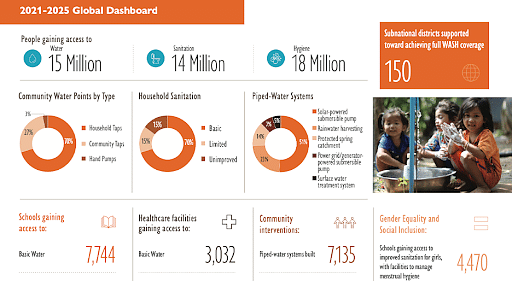
World Vision WASH created a business plan showcasing its impact on a global scale. The data accumulated was massive, but the organization used data visualization to showcase the information in exciting, compelling, and interesting ways.
For example, the design incorporated icons to represent water, sanitation, and hygiene facts. Graphs were used to communicate ratios in the brand’s color palette, and symbols made an encore appearance to demonstrate the different sectors impacted.
KIPP Bay Area Public Schools
Annual Report
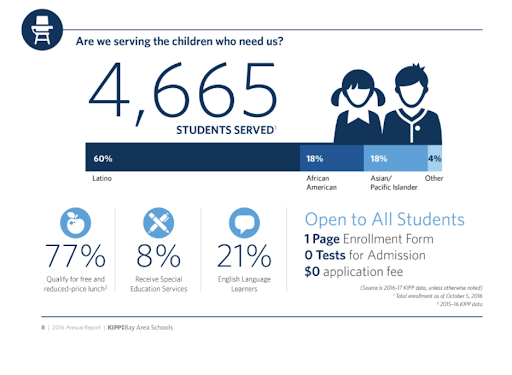
In their Annual Report, KIPP Bay Area Public Schools wanted to highlight the outreach to kids in their school system. The design incorporated playful graphics to represent the audience, and iconography to symbolize the services being offered to that audience.
Without the visual assets, you can imagine how readers may be less likely to read and grasp the information. And without that, it’s hard to communicate impact in an annual report.
Gender Pay Gap
Online Article
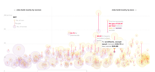
Data visualization isn’t reserved for official reports or business plans. This example of data visualization in marketing was spotted in an online article. The graphic represents the gender pay gap with the size of the circles aligning with the number of people working those jobs, men and women included. It’s also a highly interactive visual asset that highlights information as you scroll on the page. Check it out for yourself using the link above; it’s quite inspiring.
Spotify Culture Next 2021
Web Design for Global Trend Report

Spotify created a highly interactive website design reliant on data visualization to tell the story of its global trend report. For example, in this screenshot, you can see the front lever represents how listeners view music’s healthy factor. The various spaces of the design empower you to explore the different roles music plays in people’s lives. Plus, you can’t ignore the cool factor of the accompanying music on this site. It is for Spotify, after all.
Looking forward to a career in Data Analytics? Check out the Data Analytics Training Course and get certified today.
Learn More About Data Visualization in Marketing
If this article inspired you to create your own data visuals, then take the next step and enroll in Simplilearn’s Data Analytics certification program and start your career as data analytics professional. You can also check out Simplilearn's Introduction to Data Visualization course. It’s a free, online course that helps you learn how to make sense of data by creating different examples of data visualization like informative graphics, reports, and dashboards.
