Optimizing Your Data Story


“We are all storytellers. We all live in a network of stories. There isn’t a stronger connection between people than storytelling.”
Jimmy Neil Smith, Director of the International Storytelling Center
Introduction
Picture it with me: a time when you were a child and someone read your favorite story to you, or when you were an adult and you read someone their favorite story. I want you to focus on the emotions remembering that experience generated. Personally, I thought about reading the book, “Guess How Much I Love You,” to my daughter when she was young and how she would sit on my lap and hang on to every word. The smile on her face, and the joy in her voice as she talked about the story, was priceless.
I share the above because storytelling, whether with a child or in the boardroom, when done right, will leave an impression on people and often evoke an emotional reaction. This is why we have seen the recent rise in storytelling as a key skill for finance and FP&A professionals. In particular, we are regularly asked to tell stories with data; the rest of this article focuses on how we can optimize our data storytelling.
In this article, we discuss:
- Why storytelling is so important
- How to make your data visual
- How to craft persuasive narratives
- Bringing it all together in the presentation
Importance of Data Storytelling
“The human mind is a story processor, not a logic processor.”
– Jonathan Haidt, social psychologist
Data storytelling is a key skill, and the role of Storyteller is one of the five most common roles of FP&A professionals, according to research conducted by FP&A Trends. The average FP&A professional spends more than half of their time working with data. Unfortunately, we spend almost all of that time analyzing the data. Most finance professionals need more time to think about how to convey the data story in a way that gets the audience’s attention and influences them to make intelligent decisions with the data.
The data storytelling process starts with analyzing the data and gathering insights; this stage is critical. One can be a master storyteller, but if the data does not support the story or provide insights that can drive actionable results, you will fail to influence the business positively. However, for most finance professionals, conducting analysis and finding insights is not the problem. The problem is we fall flat when we present the data.
I learned this lesson the hard way a few years ago when a presentation went completely sideways. After the presentation, I asked my boss what went wrong, and I can still hear his words in my mind today whenever I think about it. He said, “Paul your analysis was brilliant, but your presentation lacked.”
That was a great reminder that we cannot put all our time into the analysis and think others will understand the message in the data because we understand the message. We must spend time crafting the story from the perspective of the audience.
Framing the story is about understanding your audience and creating a narrative that provides value to them. It requires creating compelling visuals and a powerful narrative, then bringing it all together by presenting it in a way that will interest and engage your audience.
It is important to remember the story is not just for big presentations but should permeate all of our reporting, from variance commentary to board decks, as every number has a story.
Making your Data Visual
“Data visualization helps to bridge the gap between numbers and words.”
– Brie E. Anderson
Data visualization is about more than just creating fancy charts and visuals so your audience does not have to look at a bunch of numbers and tables. It is about using visuals to make it easier for your audience to understand your story.
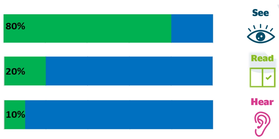
We don’t use visuals just because they look pretty. The average person will retain 80% of what they see, 20% of what they read, and 10% of what they hear. Combine that with the fact that a human can process an image much faster than they can process text, and you have a compelling reason why you should use visuals to enhance the story.
When it comes to creating visuals, it is important to keep it simple and focus on the main point of each graph. I have seven basic visualization design principles I like to follow; these principles come from Storytelling with Data by Cole Nussbaumer Knaflic. The seven principles are as follows:
- Think like a designer – When creating visuals, design matters. It is not enough to just select the first graph in Excel and call it good.
- Keep it simple – No need for the graph to be complex; the more you have going on, the harder it will be for your audience to understand the key message of the graph.
- Ruthlessly reduce clutter – Ask yourself if it is needed to convey the main message. If the answer is no, remove it.
- Use color sparingly – Color should only be used to help strengthen the message, not because you think color will make it pretty.
- Use contrast effectively – Contrast is a great way to draw attention to something specific in the data. Use it to enhance your message
- Select the right visual – Understanding what visual is best for your data will make it much easier for your audience to gain insights from your data.
- Context is important – Provide enough context for your audience to understand the message the graph is trying to portray. Do not make your audience guess.
Below is an example of the difference a well-designed graph can make in telling the story.
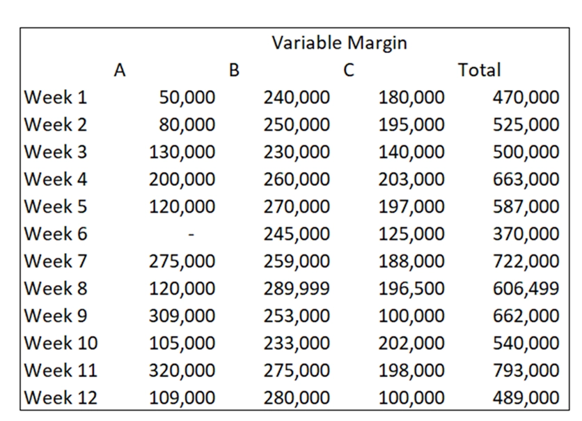
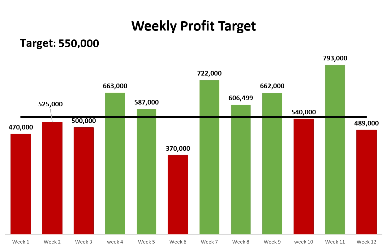
As you compare the two visuals, you can quickly see the first visual is a data dump that shows weekly performance, but the reader is left to guess what it all means. In the second visual, you can quickly see the goal is to hit a weekly profit target of 550,000 and see what weeks this was achieved and what weeks it was not achieved due to the color coding. You can also see many of the other design principles we discussed above being utilized here to include color, ruthlessly reducing clutter, etc.
As you spend time using the design principles above and setting time aside to be deliberate in how and when you use visuals, you will find that they will make a huge difference in the message you are sharing with your audience. As you work on your visuals, you also need to focus on the narrative you will share with your presentation.
Crafting a persuasive narrative
“A lack of narrative structure, as you know, will cause anxiety.”
– John Dufresne
If you are like me, on more than one occasion, you have left a presentation or finished an article or book wondering what in the world the person was talking about. It was hard to follow because the narrative lacked structure. I once had a VP who told me, in his opinion, that finance professionals did not spend nearly enough time thinking about what they were going to say. At the time, I thought it was good advice, but did not give it a lot of thought. However, today I could not agree more with the idea. Finding a framework to help you think about how to craft a persuasive narrative is really important. Many frameworks exist, but one framework that can be used is Monroe’s Motivated Sequence:
- Attention – Find a way to grab the audience’s attention
- Need – Show to the audience the need for what you are recommending
- Satisfaction – Provide a recommendation to solve the need
- Visualization – Help the audience see the benefits of the solution
- Action – Include a call to action
Using a framework like this can help you put together a narrative that will persuade your audience to action. As finance professionals, the goal is to provide value-added insights, and this requires persuading your audience to action. A well-structured narrative will go a long way toward helping you influence your audience.
Presenting: Bringing it all together
“I think that no one, or very few, are born as good presenters. It’s a skill that you learn.”
– Dale Carnegie
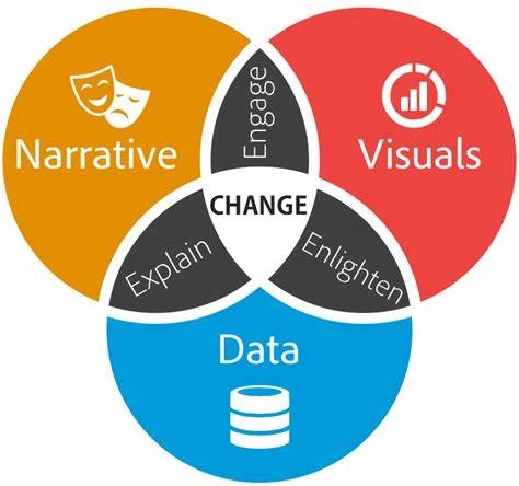
The last part of the process is the presentation, whether that be a formal presentation or an email. I love the below image from Brent Dykes, showing how we can drive change by bringing data, visuals, and narrative together.
We bring this all together in the presentation we give. Within Finance, I think most of us are least comfortable giving formal presentations, so we will focus on that area and use a framework that Ron Monteiro created called ACE for your presentation. ACE stands for
- Audience – understand and cater to your audience
- Content – create insightful and impactful content using visualization
- Execution – Remember body language and vocalization are very important
The ACE framework is very easy to implement and focuses on the three main areas of presentation. If you think about each of these and how they will influence your presentation, and practice ahead of time, the next time you give a presentation you will be much more likely to ACE it.
Conclusion
“Numbers have an important story to tell. They rely on you to give them a clear and convincing voice.”
Stephen Few, data visualization expert
Data storytelling is one of the most important skills for FP&A professionals today. We need to be able to not only analyze the data but also create compelling visuals and narratives so we can drive change. The good news is, this is a skill we can all develop with time and deliberate practice.
Many great resources exist to help us on our data storytelling journey. A few great resources include:
- Book: Effective Data Storytelling by Brent Dykes
- Website: Effective Data Storytelling
- Podcast: storytelling with data podcast
- Book: Storytelling with Data by Cole Nussbaumer Knaflic
- Book: Stories that Stick by Kindra Hall
- Club: Toastmasters – speaking club
In addition to spending time reading, practicing, and learning from experts in the field, many tools exist that can help us analyze and visualize data more easily. We have seen an explosion in BI and data visualization tools, all designed to help us analyze and visualize the ever-growing amount of data available to us in today’s world.
One tool that is designed for business professionals working in data analytics, operations, sales, supply, and finance that can help with the analysis and visualization is Power ON from insightsoftware. If you are at the point in your data journey where you need a solution that brings planning, analysis, and data visualization together in one familiar tool, Power BI, then check out Power ON. With its real-time write-back capabilities, Power ON offers you more control and flexibility over your data, taking your business beyond traditional business intelligence
Remember that technology in and of itself will not make you a great presenter but having tools that can help you in the analysis and visualization of your data can make it easier to present insights to management in a way that drives value for the business. Watch this one-minute video to see how Power ON supercharges your analysis and data visualization skills.

Optimizing Your Data Story
Watch Now