Remove Your Rose Tinted Glasses: Data Visualizations Designed to Mislead
Nobody likes feeling manipulated in any way, shape, or form. But while that may be the case, people are duped by data visualizations every day.
From political issues to sports statistics and the recent report you received on the ROI of your company blog, the internet as well as informational reports are flooded with examples of misleading data visualization.
Bad data visualizations come in many forms, with some more obvious than others. But, by knowing what to look for, you can avoid connecting with metrics that will lead your organization down the wrong path.
The best way to safeguard from misinformation is to arm yourself with tech-appropriate analytical online data visualization tools and evaluative skills that will expose the most oversimplified or malicious data visualizations.
Here, we will present a mix of the most common visual data misrepresentations together with practical tips on how not to fail when presenting data.
Learn how to spot the common tricks used to manipulate data and how to avoid the pitfalls for your own visuals.
Let’s get started.
Explore our 14-day free trial & benefit from great visualizations today!
Misleading Data Visualization Examples
To start our journey, we’re going to look at the digital world’s biggest misleading data visualization real-life examples.
Each of these unethical data visualization examples has the potential to derail your strategic efforts and take you down an informational dead end. Take heed of these poorly arranged visuals and you will know exactly what to look for when analyzing your business’s most invaluable data.
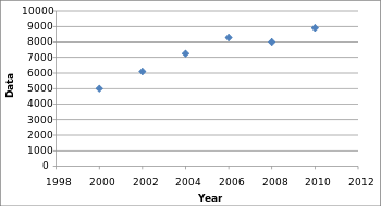
1. Truncated Y-axis
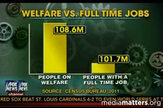
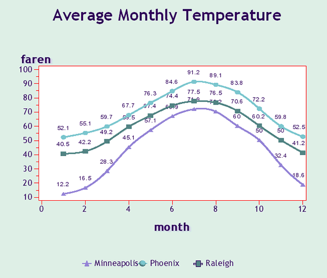
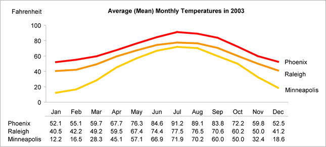
Infamous for its overuse in politics, the truncated y-axis is a classic way to visually mislead. Take a look at the graph above, comparing people with jobs to people on welfare. At first glance, the visual dynamics of the graph suggest people on welfare to number four times as many as people with jobs. Numbers don’t lie, however, and when analyzed, they point out much less sensational facts than the data visualization would suggest.
This type of misinformation occurs when the graph’s producers ignore convention and manipulate the y-axis. The conventional way of organizing the y-axis is to start at 0 and then go up to the highest data point in your set. By not setting the origin of the y-axis at zero, small differences become hyperbolic and therefore play more on people’s prejudices rather than their rationality. Notice on the graph below, originally shared by Gizmodo, how much larger the differences look when truncating the y-axis.
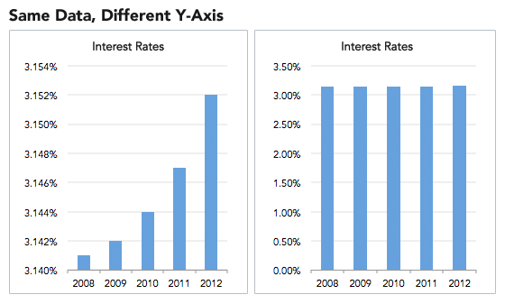
Focus on creating your data visualizations using data with a zero-baseline y-axis and watch out for truncated axes. Sometimes these distortions are done on purpose to mislead readers, but other times they’re just the consequence of not knowing how an unintentional use of a non-zero-baseline can skew data.
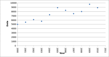
2. Omitting Data
Why lie when you can just omit? By omitting certain data points, trends that don’t actually exist can easily be created whereas some existing highlights can go unnoticed. That's because by omitting some data we are missing the context. Leaving out variables can affect how you interpret the data and what conclusions you draw from it. So whenever you’re examining a variable and its relationships, carefully consider the context in which that variable exists and deliberately seek out other variables that could affect the one you’re studying.
As an example of what happens when you omit some data, be that because you purposefully want to create a misleading data visualization or you simply want to make your work easier, take a look at the scatter plot below. By leaving out some data points, the chart that normally would be filled with dips and spikes looks much smoother and more stable. See these graphs originally published by Cogent Legal.
Vs
By only plotting every second year instead of every year, the graph appears to have a steady increase, while the real data is more volatile. Companies can take advantage of this by omitting years with significant changes in sales to model their earnings to look constant and predictable, masking the true volatility of the market. When evaluating data visualizations be sure to have all the data accessible.
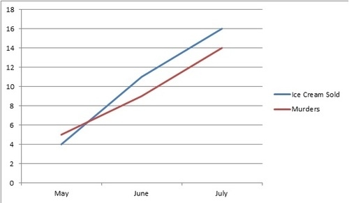
3. Correlating Causation
Any high school math class should have covered that correlation doesn’t imply causation. But looking at the headlines of the most popular internet articles (“Does X cause Y?”) and political statements it is easy to forget. Essentially, the correlation and causation scenario is the assumption that because two variables changed at the same time, one caused the other. As seen in our example below, that shows a relation between a rise in ice cream sales and murders. We are beginning to see correlating causation more and more with big data analyses. Data scientists are finding statistical patterns in data and sometimes care more about correlation rather than causation since figuring out correlation is simply easier.
That said, there are mainly two reasons why correlation doesn't always mean causation. The first one is what scientists call a "confounding variable" or third variable. Meaning an "invisible" or non-identified variable that can be affecting the two other variables and make them seem causally related. The problem with this, is that the third variable might never be discovered, hence, causation can't be confirmed.
Another scenario in which correlation and causation are difficult to prove is with directionality. This means when two variables might be caused by each other but can't prove which one caused the other. Purposely or not, correlation and causation issues happen mainly in the media, advertisement, and politics, it is very unlikely to find such situations in scientific papers where analysts are already aware of these threats.
Here’s our favorite correlating causation data visualization, but for more check out Buzzfeed’s: The 10 Most Bizarre Correlations.
4. Cherry picking

Cherry-picking is a form of data-driven deception where certain sets or sources or information are omitted from a survey, study, chart, or graph. The primary reason for cherry-picked visuals is an aim to offer clean, predictable results that fit into a neat trend, pattern, or box. The issue with cherry-picking is that it doesn’t paint an honest, objective picture, offering results that are inaccurate or missing out on vital segments of knowledge.
This visual is particularly deceiving as the lines are exaggerated. In addition to this, while the results appear to be expressed as a percentage, not every result totals 100. As such, this visual is disproportionate and doesn’t offer an accurate representation of the data at hand.
One small piece of information can completely change the perception, and ultimately the outcome derived from a KPI or metric, which means that cherry-picked visuals not only offer little value - but will serve to make a decision that harms your business.
Remember: The data you analyze from digital charts and graphs should be completely objective. If your information comes from cherry-picked sources, you will never drive the organization forward.
5. Dualing data
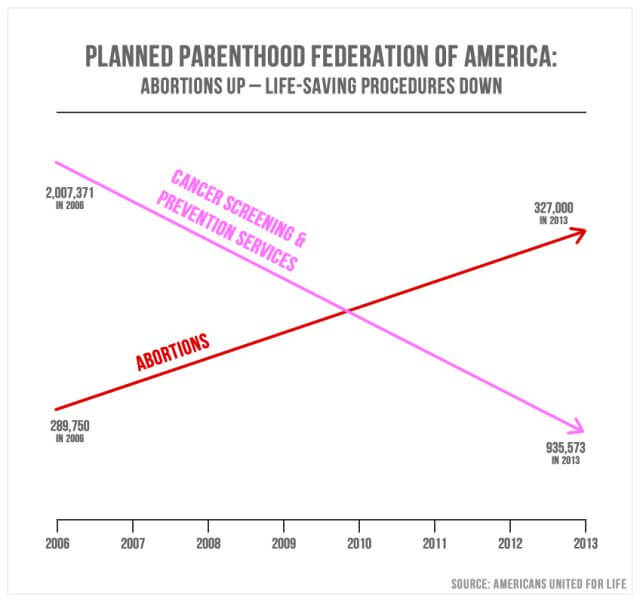
While dual-axis charts often prove incredibly effective at comparing two related informational sets that don't share a unified scale when under pressure, they can become misleading visuals when specific markers aren't set correctly or missing entirely.
In the above example from the 2015 Congressional Hearing based on Planned Parenthood, we can see clear-cut results showing a rise in abortions and a drop in cancer-related health services. This visual is deceiving as it doesn’t contain any values within its axis’, merely showing a loose trend or pattern without any real context. As such, the true meaning of the data is skewed, making it unbalanced and potentially harmful. When you use dualing data without cleared marked values, they're essentially meaningless and can be manipulated to display a result that is not representative of the truth - avoid this mistake at all costs.
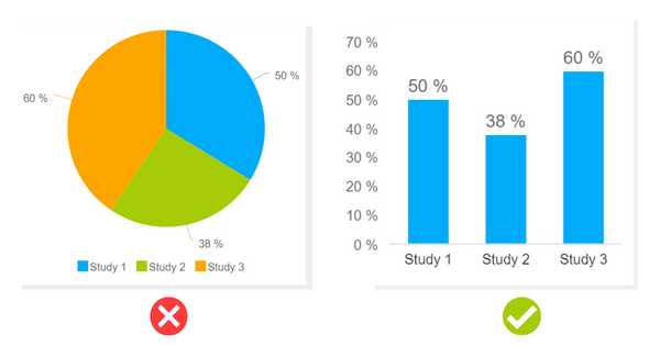
6. Misleading pie chart

When it comes to bad data visualization examples, misleading pie charts are without doubt one of the most common. Pie charts by their very nature are proportional and as such, show values that typically amount to 100% (or the entire segment of pie). But, when you’re presented with a mix of choices or variables where a survey respondent can choose more than one answer, the results can appear confusing or deceiving.
The above example accurately displays results amounting to 100%. But, in a case where 100 survey respondents, for instance, are able to choose more than one of the geographical regions based on a specific question (‘where would you relocate to for economic gain?’ for example), the pie chart instantly becomes inaccurate because many respondents may have picked both North America and Australasia. In that case, you’re not seeing things as they really are - and to avoid this level of inaccuracy, using a Venn diagram would be a better choice.
7. Using the wrong chart type
A misleading data visualization issue that plagues business intelligence (BI) across industries is making the wrong chart choice.
As you can see from the example above, from these charts that were generated with datapine's online data analysis tool, the pie chart is a poor choice as the visuals don’t represent the numbers in their best or most accurate format. Typically, a pie chart should amount to a whole (100 expressed as a percentage) - but that’s not the case in this instance. As you can see, a neat, balanced bar chart is the best choice as it presents the information in its truest, most digestible form.
Rather than cases of people manipulating data for personal gain, selecting the wrong chart type is typically down to human error or a lack of analytical experience. While your metrics and insights may be 100% trustworthy and accurate, making a poor visual choice can either dilute your results or offer outcomes that can lead you to draw the wrong conclusions.
Another way poor chart or graph choices can have a negative impact on organizational outcomes is because in these cases, the results sometimes fail to make sense at all. As a result, time becomes wasted, resources become sapped, and your data becomes redundant. Before you make your selections, be sure you carry out ample research and ensure your chart will represent your information in the most optimal way possible.
These are a few of the common ways in which visuals can mislead, this goes hand in hand with the misuse of data which is also a common practice in the media, politics, and other industries. If you want to go deeper into the topic, take a look at our misleading statistics blog post.
Explore our 14-day free trial & benefit from great visualizations today!
How to Avoid The Pitfalls of Misleading Data
If you want your data to tell the whole truth and nothing but the truth, implement these practices to avoid generating misleading data visualizations.
1. Follow Convention
By using the standard model for visual models, you can avoid misleading your reader. If your high school math teacher would mark you down on an exam for your methods of data representation, think twice.
Start your y-axis at 0 to avoid making small differences look large. The exception to this practice would be if these small differences actually mean something significant. In global climate change data, often a global average temperature increase of 1 degree per year can have dire consequences. Thus a small increase in temperature is important and needs to be highlighted. However, when looking at something where small changes don’t correlate with a big impact, start your y-axis at 0.
Following convention also goes for pie charts as well. People are conditioned to look at pie charts as equaling 100% of the data; don’t mislead people by only giving them a slice of the pie’s data.
2. Make Your Data Visualization Clear and Easy to Understand
This one should be a no-brainer, but it is often neglected in a world inundated with flashy and intricate graphs. Below are two graphs mapping out the same data. As you can see, the second graph is much easier to identify trends and more aesthetically pleasing. Don’t let sloppy visuals negate the credibility of your hard-earned data.
Unclear data visualization
Improved Data Visualization
Visualization guru Edward Tufte explains, "excellence in statistical graphics consists of complex ideas communicated with clarity, precision, and efficiency". Turn this into your mantra every time you sit down to create data visualizations.
3. Give up on PowerPoint
PowerPoint is a tool of the past. Now dashboards are in. The new dashboard software offers works with real-time data and allows you to turn numbers into visuals with only a few clicks. On the other hand, in PowerPoint performing SQL queries, and exporting the results to create charts before importing them onto slides can take a long time. With extra bells and whistles – colorful headlines, text, images – the process can take even more time. With easy-to-use SQL query builders, a drag and drop interface, and a metric builder, data visualization tools can produce results in mere minutes. The less time spent on creating data visualizations, the more time you have to understand the data.
4. Make smarter color choices
When examining misleading visualization examples, people often gloss over the more intricate design particulars. But, when it comes to representing visually-based metrics in an accurate, reliable, and digestible format, making smart color choices is essential.
To ensure you use colors that don’t detract from the core information and represent your discoveries logically, here are some best practices to consider:
- Avoid using too many colors as this will confuse the viewer and make your message difficult to absorb
- Don’t use colors that are too similar and offer little contrast as this could make your results appear misleading or less definitive
- Try not to use tones or shades that are likely to confuse people that are colorblind
5. Choose the right chart type
Earlier, when we examined examples of misleading data visualizations, we talked about the negative impact of choosing the wrong chart type. To avoid such an informational calamity, you should decide whether your insights are quantitative or qualitative - doing so will help you make an informed visual decision.
If you’re working with qualitative information, you should (that describes or categorizes), you should opt for pie charts, Venn diagrams, or pie charts and if your findings are quantitative (insights that are directly measurable), line or trend charts or histograms are usually better suited. Really dig into your metrics as well as what they mean in a real-world context and you will land on the right chart type. BI dashboard software such as datapine, provides multiple charting options and templates to help you make the right decisions when it comes to visuals.
6. Don’t present too much data
Another significant factor in misleading charts, graphs, or KPIs is cramming too much information into a small space. When you present your insights visually, the core idea is to create a narrative and tell a story. When you add too many sources or variables into the mix, you will make your results look messy, diluting the information in the process.
Before you set about collecting and presenting your insights, it’s vital to think about data storytelling and choose only the variables that are directly relevant to your objectives. If you find yourself with too many variables or too much information, be ruthless. Go back to the drawing board and trim the informational fat until you have data that is clear, concise, and you know will result in a quality, accurate, and impactful visualization.
7. Think for Yourself, Question Authority
With your new skills of sniffing out faulty data and misleading information, make sure to review each data visualization with a skeptical eye before you present it.
More importantly, don’t let your data become infected with these cheap tricks. Create a beneficial dashboard culture in your company to be sure that every piece of data and every visualization has been scrutinized before it goes public.
The Impact Of Bad Data Visualizations
Now that we’ve explored common instances of misleading visually-based metrics and considered how to avoid making these common mistakes, we’re going to look at the impact of working with unethical information or making poor choices.
Fragmented narratives
Informational storytelling is one of the biggest components of a successful BI strategy. One of the biggest mistakes people make when working with visual information is working with an image, or images that only paint fragments of an entire picture.
When this happens, key insights and discoveries are missed. In addition to the data becoming less persuasive, it breaks up a narrative into illogical parts which, in turn, will make your BI efforts redundant. When this happens, you will suffer from a consistently poor return on investment (ROI) while creating inefficiency throughout the organization.
Poor decision-making
Whether you’re talking about the wrong scale, poor chart choices, or bad design, working with misleading metrics often results in poor decision-making.
When your insights aren’t telling the truth, you will make ill-informed decisions that will essentially:
- Drain your time and budget
- Lead to ineffective sales and marketing campaigns
- Put a strain on your internal processes
- Drive down staff engagement and loyalty
- Stunt your organizational growth
Operational and financial inefficiency
Working with insights that are inaccurate or misleading will also result in poor operational as well as financial efficiency.
Without concrete visual insights that tell you exactly what is working and what isn’t, it’s unlikely that you will ever get to the heart of the issues that sap your budgets or drive down productivity. As a result, your operational, as well as fiscal processes, will be poor and you will fail to reach your organizational key goals or milestones.
Explore our 14-day free trial & benefit from great visualizations today!
Key Takeaways On Misleading Visuals
We’ve explored the most misleading data visualization examples and offered practical advice on how to achieve consistent informational enlightenment in the digital age. Now it’s over to you.
To ensure you connect with the best visual metrics for your business and enjoy continual organizational growth in a cutthroat commercial world, start your free 14-day datapine trial. We will help you level up the company's analytical strategy free from the perils of misleading visualizations.