


Data consists of a vast array of discrete objects, out-of-context events, and scattered facts. When we process this data, it transforms into a wealth of information. Further refining this information, drawing on our experience, judgment, and expertise, turns it into valuable knowledge. However, the critical challenge remains: how do we extract meaningful insights from raw data? The answer lies in Exploratory Data Analysis (EDA).
EDA is a powerful process for investigating datasets, elucidating key themes, and visualizing outcomes. It employs a variety of techniques to uncover deeper insights within a data set, revealing its underlying structure. Through EDA, we can identify significant variables, detect outliers and anomalies, and test foundational assumptions. This approach helps in developing models and determining the best parameters for future predictions. In essence, EDA is the essential tool for making sense of complex data and guiding analysts to informed and accurate conclusions.
Before we delve into EDA, let us understand where EDA comes from in the whole data analytics process. For this, we need to understand the CRISP-DM model.
CRISP-DM: A Comprehensive Framework for Data Analytics Projects
CRISP-DM is a helpful tool to understand the process of data mining. It is like a roadmap that guides you through the steps involved in getting insights from data. CRISP-DM stands for Cross-Industry Standard Process for Data Mining. This method was created in 1999 by a group of experts from businesses and universities. It has become the most common way of approaching data mining, analytics, and even other data science projects.
Even though there are phases, you don’t have to follow them in a super strict order as the model is flexible. The arrows in the illustration show the most common back-and-forth movements you might make, but you can adjust as needed to make sure everything is done correctly.
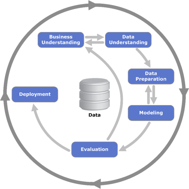
The outer circle symbolizes the cyclical nature of data analytics itself, often the lessons learned during the process trigger new questions that benefit from the experiences of the previous ones.
1. Business Understanding
This first phase focuses on understanding the project objectives and requirements from the business point of view. We then convert this knowledge into a data analytics goal and a preliminary plan designed to achieve the objectives. So, what is the difference between a business goal and a data analytics goal?
A business goal states an objective in business terminology and a data analytics goal states a project objective in technical terms. For example, the business goal might be “Increase sales to existing customers.” A data analytics goal might be “Find how many widgets a customer brought, given their purchases over the past three years, demographic information and the price of the item.”
It is important to make sure you understand the business question. In the worst-case scenario, you spend a great deal of effort producing the right answers to the wrong questions.
2. Data Understanding [This is the step where EDA comes into the picture]
The data understanding phase starts with the initial data collection. When we have the first data material we proceed with data exploration. In this step, we familiarize ourselves with the data and identify data quality problems. This is done by querying and visualizing the data and report values.
Example of steps: visualize variables, distribution of key attributes, relations between attributes, properties of significant sub-populations, simple statistical analyses.
These analyses can directly address the data mining goals, but they can also contribute to the data description needed for further analysis. An important step in data understanding is to examine the quality of the data. Try to figure out if the data contains errors (faulty sensor etc.), and if there are errors how common they are. Are there any missing values in the data?
3. Data Preparation
The data preparation phase covers all activities to construct the dataset that will be fed into the model. The work we do in this step are likely to be performed multiple times, or we discover something that leads us to redo the data preparation.
The tasks in this phase include feature/attribute selection as well as transformation, cleaning and setting up the data before developing a model. Remember that all transformations you do to the data will impact the model and its results. In this step, you can also consider if it makes sense to do feature engineering.In feature engineering, you create new attributes/columns, constructed from one or more existing attributes.
Example: area = length * width.
4. Modeling
When you are working on a data science model, this phase comes into the picture where we try out various models (supervise, unsupervised learning, etc.) and calibrate the model parameters to optimal values.
5. Evaluation
At this stage in the project, you have built a model (or models) that appears to work well from a data analysis perspective. Now, we thoroughly evaluate the model and review if it properly achieves the business objectives. In the previous modeling step, we evaluated the model with factors such as the accuracy and generality of the model. In this evaluation step, we assess the degree to which the model meets the business objectives and if there is some business reason why this model does not perform well.
6. Deployment
In this phase, the knowledge gained is organized and presented in a way that the customer can use it. Depending on the requirements, the deployment phase can be as simple as generating a report or as complex as implementing a repeatable data mining process across an enterprise. For more advanced deployment we as Data Analysts work in close collaboration with other professionals. It is important that the customer understands up front what actions need to be carried out in order to actually make use of the created models.
Monitoring and maintenance are important issues if the data mining result becomes part of the day-to-day business and its environment.
Purpose of Exploratory Data Analysis
With the explanation of the CRISP-DM model it is now more or less clear that EDA is an essential part of any data analytics project, but what makes EDA essential is what we are going to understand now. A dataset is not always small in terms of the number of features, sometimes it can have too many features, many of them not even useful in the analysis.
For example, a column containing just a single value does not add any useful information, and a column with too many missing values may not provide accurate insights, hence, it is important to understand the features and what data is present in those features. For large datasets, going though all the features to build an understanding of the data can be extremely tedious and overwhelming. EDA is an aid in such situations and it helps in:
- Understanding the depth and breadth of data before making any assumptions
- Identify incompleteness, errors, and patterns in the data
- Check for data anomalies and outliers present in the data
- Identify relationships among the variables
- Identify requirements for additional features that can be created using the existing features
Types of Exploratory Data Analysis
EDA can be graphical or non-graphical, meaning, it can be conducted either by visualising the data or by describing the summary statistics of the data. EDA can also be univariate or multivariate (generally bivariate), meaning, Univariate EDA looks into one variable (column) at a time while Multivariate EDA looks at two or more variables at a time to understand the relationships.
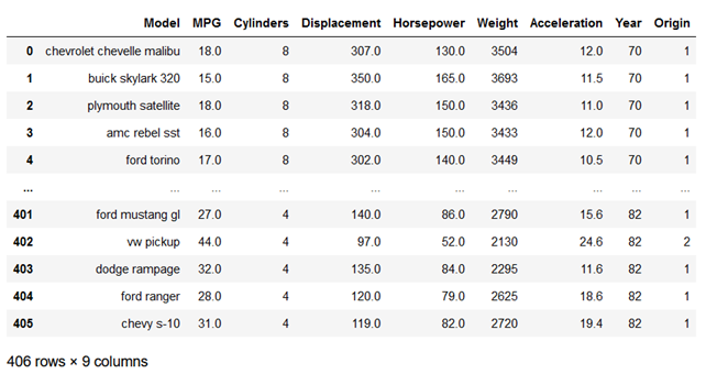
We will understand the types of EDA with the help of an example where we use a popular ‘Cars’ dataset in Python Jupyter Notebook to conduct the EDA. Let’s first look at the data.
Cars Dataset contains 406 rows and 9 columns with the first column containing Cars’ model names and the rest of the columns providing more details about each model.
1. Univariate EDA
We will try to build an understanding of each column present in the dataset. First, we list down what type of information is present in each column and how many rows contain the data for each column.
By simply executing the following instructions we can generate this information.
cars_df.info()
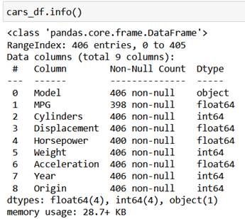
As visible for the column MPG, we only have data in 398 rows out of 406 rows and most of the data is numeric apart from Model name and Year.
To understand the statistics of each variable, we execute the ‘describe()’ function in Python.
cars_df.describe()
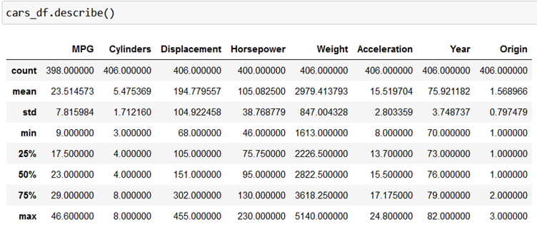
The output provides us with key statistics like count, mean, standard deviation, minimum and maximum value and values in different quartiles.
Next, we check missing values in each column.
cars_df.isnull().sum()
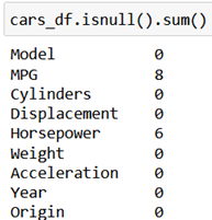
The output shows that only the columns ‘MPG’ and ‘Horsepower’ have missing values.
Till now we have seen a non-graphical form of Univariate EDA, now let’s create some graphics to understand each variable in more detail. We will create a histogram for each variable to understand the distribution of data for each variable. We will execute the following piece of Python code.
from matplotlib import pyplot as plt
import matplotlib.pyplot as plt
cars_df.hist(bins=20, figsize=(15, 10))
plt.tight_layout()
plt.show()
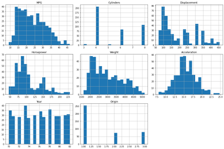
The output displays the distribution of individual variables.
We will now use a box plot to check for any outliers in each variable.
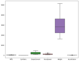
We now have a good understanding of each of the variables and it is time to move to Multivariate analysis.
2. Multivariate EDA
First, we create pairplots to understand the relationship between each pair of variables. We use Seaborn library in Python to do this.
sns.pairplot(cars_df)
plt.show()
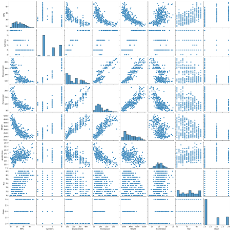
The output shows relationship between different pairs of variables, some have inverse while some have direct relationship, many have no relationship as such.
Now, we calculate degree of correlation between each pair of variable to assign a number between -1 and +1 which will measure the correlation coefficient between each pair of variable.
correlation_matrix = cars_df.corr()
plt.figure(figsize=(10, 8))
sns.heatmap(correlation_matrix, annot=True, cmap=’coolwarm’, linewidths=0.5)
plt.title(‘Correlation Matrix’)
plt.show()
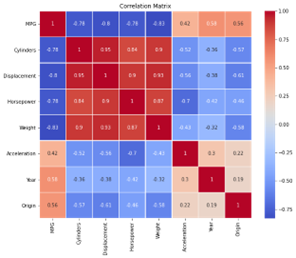
The correlation matrix above clearly indicates that the columns Cylinders and Horsepower are highly correlated, which is obvious, while columns Acceleration and Horsepower are highly inversely correlated and same is the case with columns Displacement and Acceleration.
We will now conduct Multivariate Regression Analysis to understand how all independent variables collectively impact a dependent variable. In this case, MPG (Miles per Gallon) is our dependent variable.
import statsmodels.api as sm
#Define the independent variables and the dependent variable
X = cars_df[[‘Cylinders’, ‘Displacement’, ‘Horsepower’, ‘Weight’, ‘Acceleration’, ‘Year’]]
y = cars_df[‘MPG’]
#Add a constant to the model (intercept)
X = sm.add_constant(X)
#Fit the regression model
model = sm.OLS(y, X).fit()
model_summary = model.summary()
model.summary()
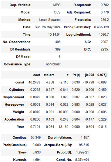
In simple words, we can summarise the output as follows:
- The model explains a substantial portion (70.7%) of the variance in MPG.
- Weight and Year are significant predictors of MPG.
- Horsepower also significantly affects MPG but to a lesser extent.
- Cylinders, Displacement, and Acceleration do not significantly affect MPG in this model.
- The model is statistically significant overall, but there may be issues with the normality of residuals and potential multicollinearity (high correlation between predictors)
After looking at the “Cars” data in all sorts of ways (both one variable at a time and how they relate to each other), we now have a good grasp of what is in the dataset. We understand the important details of each piece of information (like average miles per gallon) and how they connect. We used charts, graphs, and calculations to get this understanding. This means we can move on with further analysis.
Tools for Exploratory Data Analysis
We saw in the ‘Cars’ dataset example how Jupyter Notebook for Python is an easy and effective tool for conducting quick EDA. However, there are several other tools that can be used for conducting EDA, both graphically and non-graphically.
1. MS Excel
Microsoft Excel is an amazing tool to conduct EDA when you have a small dataset with a few hundred or thousand rows. You can manually generate statistics like mean, min, max and other values for each variable using simple Excel formula. You can also generate charts like histograms, Pareto charts, box plots, scatter plots, etc. to develop a deep understanding of the dataset.
2. MS Power BI
Microsoft’s Power BI is an amazing market-leading tool for data visualisation and can generate great insights from the data with the help of a variety of charts. Though the tool has limitations in terms of manual effort required in carrying out analysis, you can generate scatter plots, box-plot, line graphs, histograms, and heatmaps but each time you can only create an analysis for one pair of variables, unlike in Python, which generates chats for each pair in a single visualisation.
3. Tableau
Tableau, just like Power BI, is another powerful tool for data visualisation, it provides interactive and visual data exploration capabilities, which make it easier to discover patterns, find relationships between variables, detect outliers, etc.
4. R
Just like Python, R is also a versatile and powerful language for EDA. It contains a rich ecosystem of libraries/packages that provide extensive data analysis, statistical analysis, and visualisation abilities. ‘DataExplorer’ package in R is an effective methodology to automate the generation of EDA report.
Conclusion
In any data-driven project, we need to first get to know the data we are working with. This is called Exploratory Data Analysis (EDA), and it is a super important step. EDA helps us figure out what kind of data we have, how much missing data is there, and if there are any weird things going on. We use charts, graphs, and calculations to see what patterns there might be and what the important pieces of information are. There are tools like Python, R, Tableau and Power BI that can help us do this, and they can show us the data in visuals and numbers. By doing EDA, we clean up our data and make sure it is ready for the next step. This way, we can be confident our results are accurate and based on good information. Basically, EDA helps us avoid building our analysis on a shaky foundation.

)
&description=&image=https://businessanalyst.techcanvass.com/wp-content/uploads/2024/02/What-is-the-purpose-of-EDA-1024x535.webp)