In 2010, I wrote:
With enough visualization methods to warrant a periodic table, it can be confusing to know what to use and when—and which visualizations are even worth considering at all. This series of posts is intended to introduce you to the visualization approaches that we find most useful, practical, and audience-friendly.
Sadly, only two data visualization profiles emerged from that effort: Small Multiples & Parallel Coordinates. Not wanting to leave unfinished business unfinished for much more than a decade, I’m reviving “Better Know a Visualization Series” with an interactive twist:
Why use a scatterplot chart?
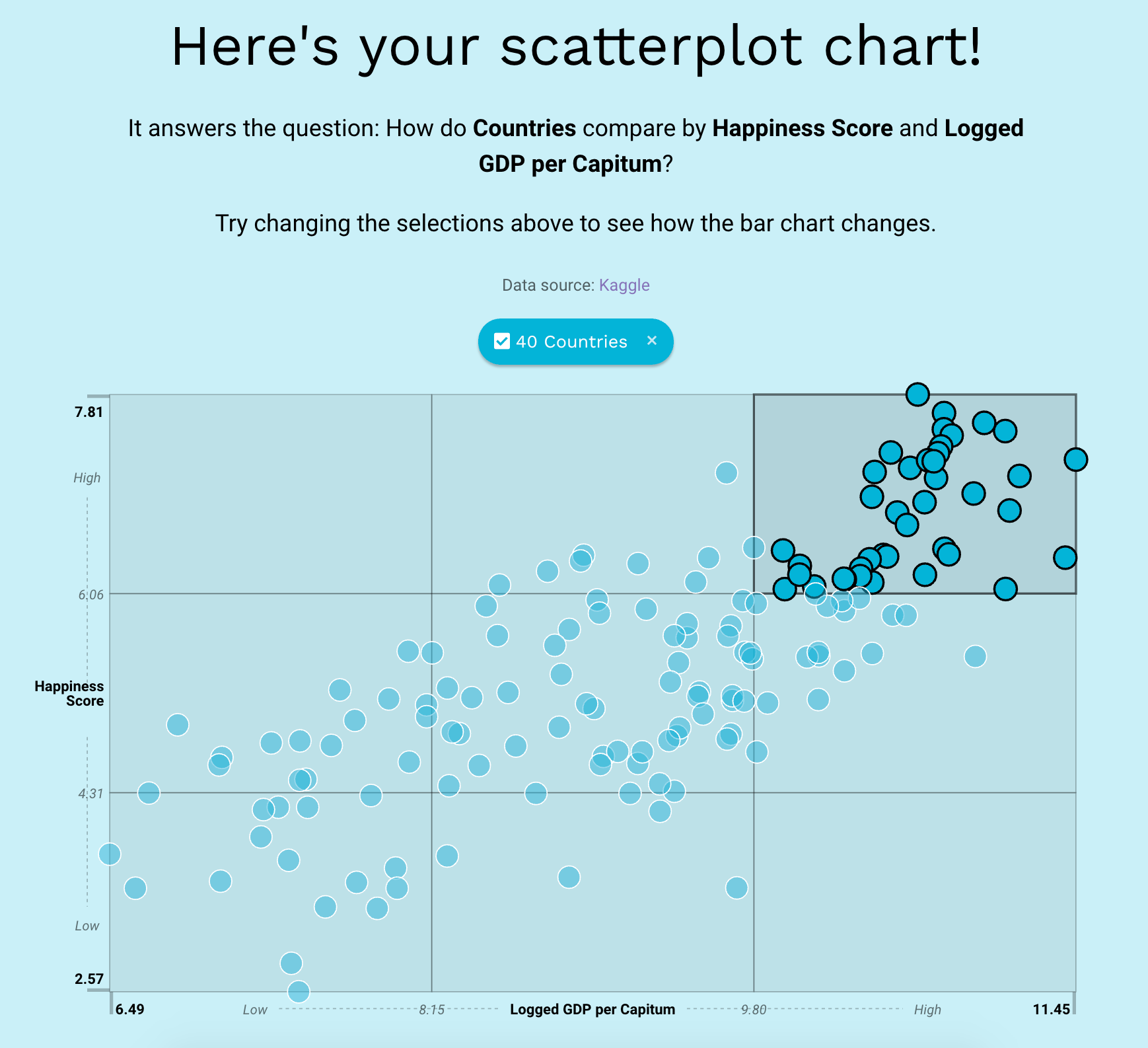
A scatterplot chart shows how a bunch of items (e.g. people, places, user segments) compare to each other when plotted by two measures. The items are positioned (or scattered) on a two-dimensional plot to reveal patterns such as:
Outliers with unusual combinations of values;
Clusters of items that share similar combinations of values;
Overall relationships between the two measures (e.g. height and weight are correlated).
Jump into our live Juicebox teaching app to explore a Scatterplot in action…
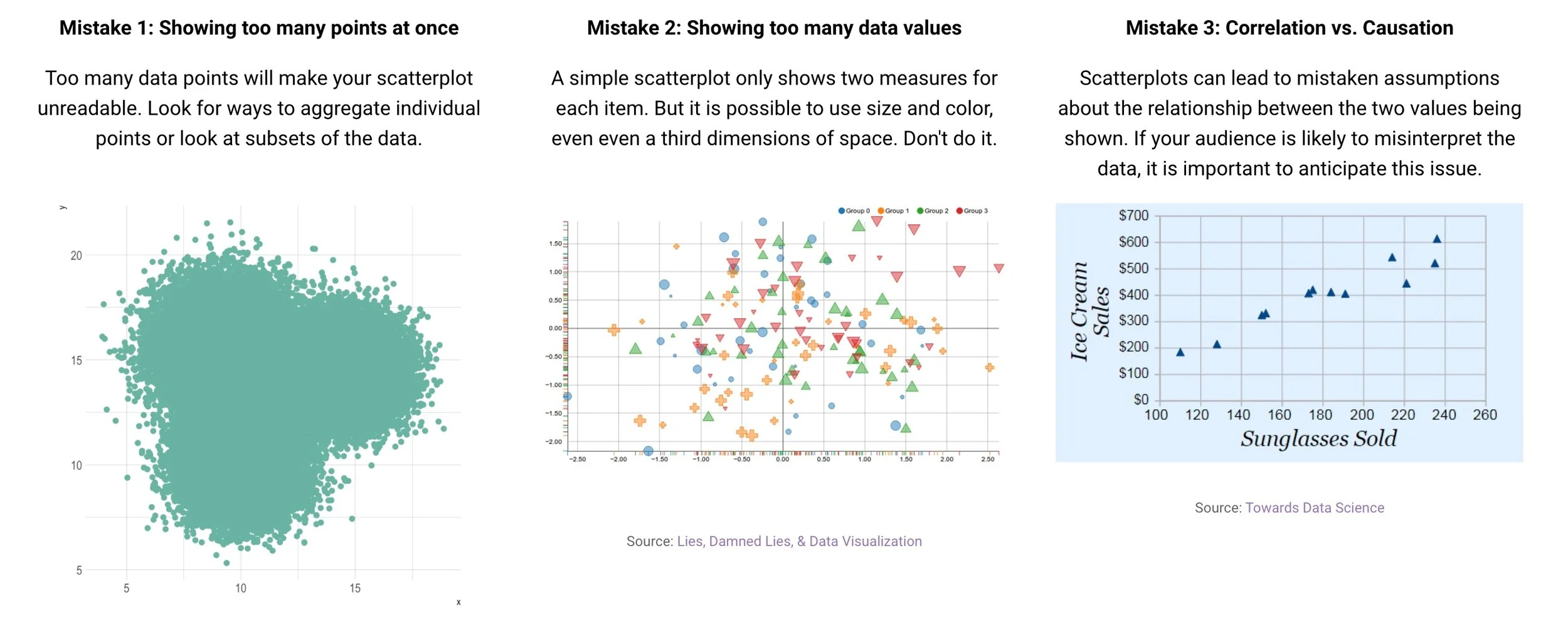
and see common mistakes people often make.