March is Women’s History Month, and we have been celebrating all month long on social media and as an organization! We wouldn’t be the same company and our industry wouldn’t be what it is without the amazing women in each! We wanted to take some time at the end of the month to celebrate female pioneers and influential women in data visualization and storytelling!
Florence Nightingale:
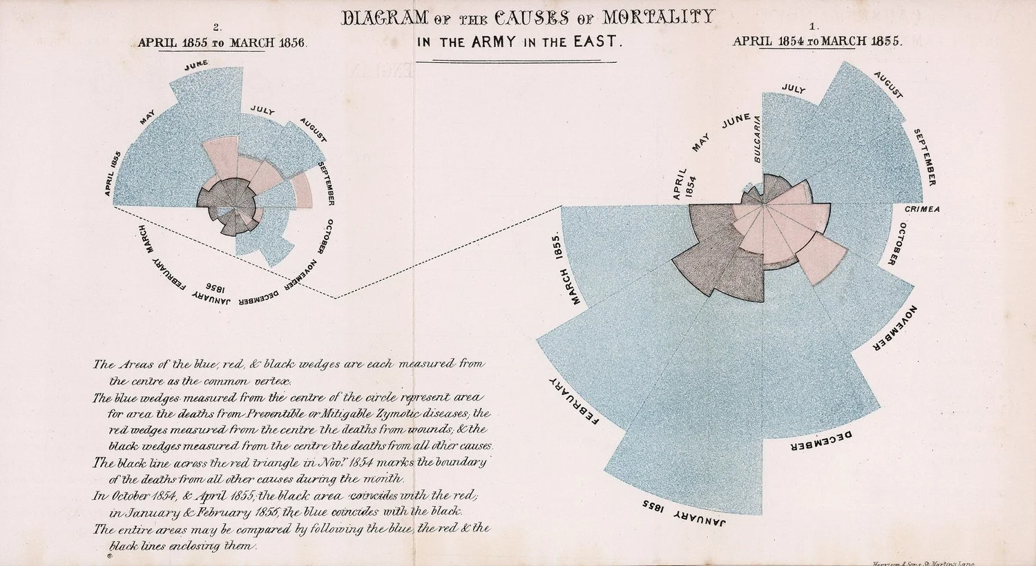
Florence Nightingale is considered to be one of the first pioneers of data visualization. While she’s best known for her advancements in nursing, she also is credited with being one of the most influential early figures to not just use data, but to show it in a way that could impact and move her readers - who were ordinary people and even Queen Victoria herself. Nightingale was known for her love of statistics. And during her time working in a military hospital, she helped to prove that hygiene and cleanliness of the hospitals were directly linked to soldier deaths in combat. She used her experience in nursing and love of statistics to take data and information that were collected and turn it into charts and graphs like the one below. However, because she was a woman in the 1800s, she isn’t adequately credited for her advances of data visualizations along with the “founding fathers" we are more familiar with.
Lea Pica:
Lea Pica is known worldwide as a data presentation guru, or as she describes herself, “Let me be your Slide Sherpa. Your Viz Vizier. Your guide on the exciting road to presentation enlightenment.” Pica used her experience in musical theatre to bring a “performance” aspect to her professional career. But try as she might, she realized that even all of the bells and whistles she thought would help her successfuly grab attention, were falling flat. She became a self-taught visualization expert and now, she’s among the ‘leading ladies’ of the data visualization and presentation world!

Amanda Cox:
Amanda Cox is an America journalist and data visualization that is well-known for her work as the data designer at the New York Times where she rose to serve as editor of The Upshot section. She worked as a graphics editor from 2005 through 2016 at the NYT. And her desk created the infamous election monitoring needle we see from the NYT every election cycle since 2016.
Cox is known as the “Michael Phelps of infographics,” a title we are quite fond of! In her opening statement of her keynote at the OpenVis Conference in 2013 she popularly said that ultimately design isn’t about typography or whitespace, but rather empathy - it’s about creating visualizations that readers can both understand and connect to emotionally. Since Cox's tenure, the Times has "led the field of innovative information graphics" and "raised the bar of journalistic interactive visualization."
She has also served as the judge for data visualization competitions, and several of her data visualizations were selected for The Best American Infographics 2014 and The Best American Infographics 2016. It’s easy to see why we would include her in this list of influential women who are cemented into the history of women in data visualization.

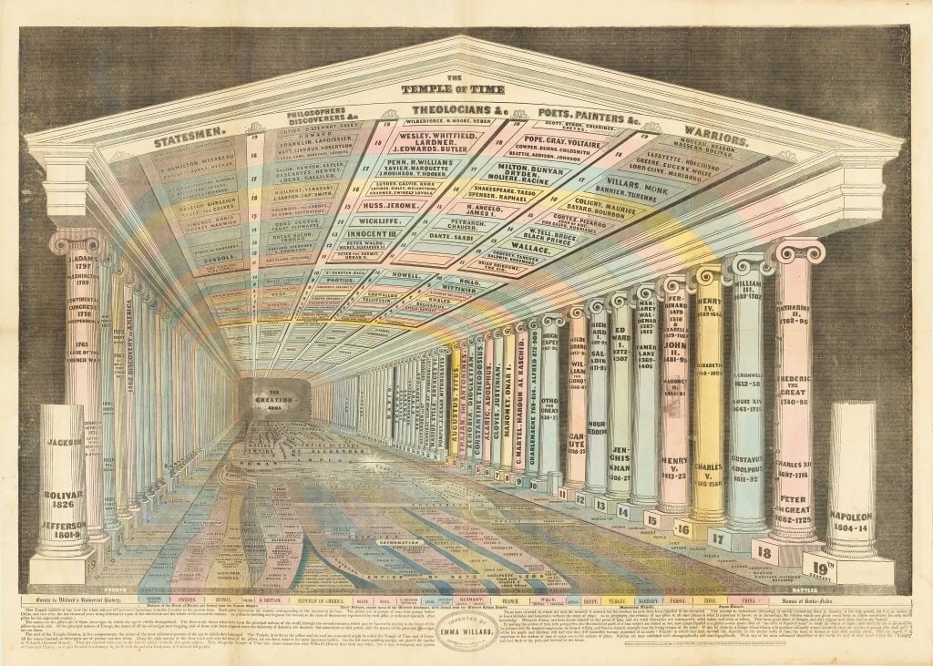
Emma Willard:
Emma Willard is probably best known for her visually-stunning maps, and being America’s first female map maker. Her Temple of Time visualization is one that she hand shaded and details the timeline of world history. She used a flow diagram to showcase the rise and fall of empires throughout history. Willard described her reasoning for this visualization in this way, “By putting the course of time into perspective, the disconnected parts of a vast subject are united into one, and comprehended at a glance;–the poetic idea of “the vista of departed years” is made an object of sight; and when the eye is the medium, the picture will, by frequent inspection, be formed within, and forever remain, wrought into the living texture of the mind.