Remove understanding-bullet-graphs
article thumbnail

Understanding Bullet Graphs

The BAWorld

Bullet Graph. A bullet graph is used to compare two measures in a single bar. A bar graph can give many insights, but it does not provide insights for comparison against a threshold. The post Understanding Bullet Graphs appeared first on Business Analysis Blog - Techcanvass.

article thumbnail

What, Why, and How of Data Visualization

The BAWorld

Quick and Easy : Visuals communicate easy-to-understand information precisely. Dynamic Updates : Instead of creating more and more charts and graphs, we can dynamically change the data selected and see how it changes the graphs by making the visual interactive. Is the visual delivering the insight or message which was intended?

Insiders

Sign Up for our Newsletter

This site is protected by reCAPTCHA and the Google Privacy Policy and Terms of Service apply.

article thumbnail

13 Easy Tips to Create an Agile Persona -The Most Important Attributes Every Organization Needs

Agilemania

Persona is a great way to understand user behavior and user motivations. There are two common approaches to understanding user behavior and designing the right user experience: Organizations that use visualizations to show their user journey. . Visualizations are crucial to understanding how customers act.

Agile 98
article thumbnail

Discover 20 Essential Types Of Graphs And Charts And When To Use Them

Data Pine

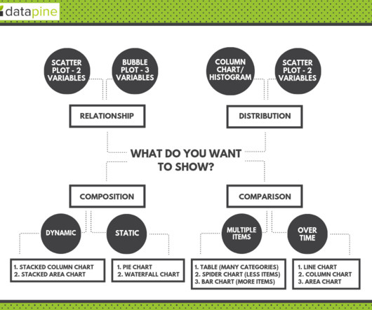
Table of Contents 1) What Are Graphs And Charts? 2) Charts And Graphs Categories 3) 20 Different Types Of Graphs And Charts 4) How To Choose The Right Chart Type Data and statistics are all around us. So, how do you make sure you are using and understanding graphs and charts in the right way? Let’s dive into them.

article thumbnail

Logarithms Unmuddled

Perceptual Edge

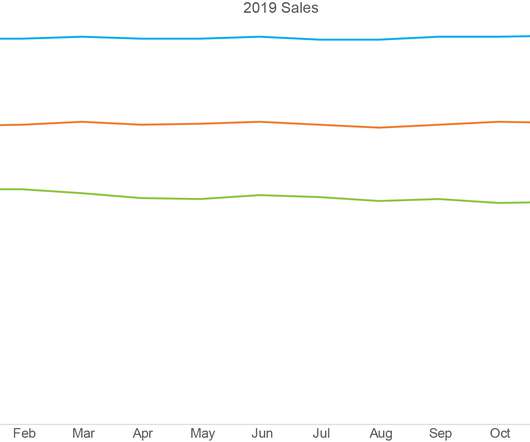
I often write about topics that I myself have struggled to understand. Until recently, my understanding (and misunderstanding) of logarithms stemmed from limited encounters with the concept in my work. Logarithmic scales make it easy to compare rates of change in line graphs because equal slopes represent equal rates of change.

article thumbnail

Better Analytics Through AI: Our Take on Gartner’s AI Trends

Sisense

It was only natural for us here at Sisense to put significant investment into knowledge graphs, NLP, and automated machine learning. In a similar way, the forthcoming “Explanations” feature provides users with possible drivers of the movements in the data automatically, using knowledge graphs to go beyond the boundaries of their charts.

article thumbnail

What Is Ad Hoc Reporting? Your Guide To Definition, Meaning, Examples & Benefits

Data Pine

In essence, you build ad hoc financial reports whenever you need to gain a deeper understanding of your financial data. Data visualization helps in understanding larger or smaller volumes of data much faster than a written or spoken word. Essentially, you (or a stakeholder) want to know your gross profit margin asap.

Retail 104