

Bullet Graph
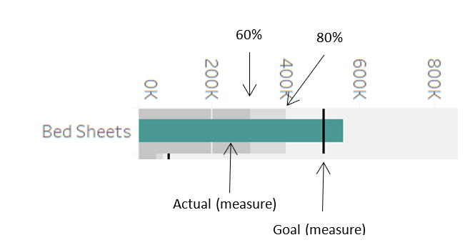
A bullet graph is used to compare two measures in a single bar. It is best used to compare the progress of one primary measure against a set standard (secondary measure). The bar represents the primary measure, and the reference line across each bar represents the secondary measure. Also, the measure’s progress against the goal measure is shown in different percentages of goal completion.
It is more powerful and advanced in comparison with a bar chart. A bar graph can give many insights, but it does not provide insights for comparison against a threshold. For example, actual sales against the targeted sales goal, actual humidity against the average humidity for the month or number of persons convicted for crimes against persons arrested, and much more.
Examples
Example 1:
Let us look at a data set that gives us details of a sales store’s profits and target profits. It has a category column containing values like biscuits, clothing, vegetables, fruits, etc. Our goal here is to find out the categories which have exceeded the target values. For this, we will compare the profit and target profit values.
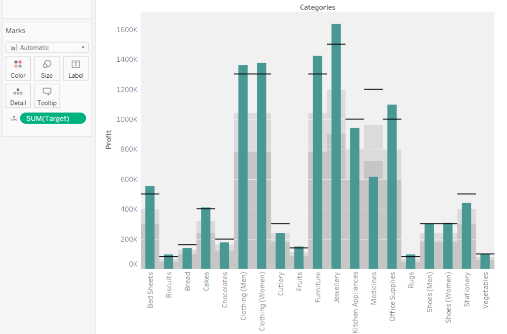
Figure 2 shows green bars for profit and black horizontal lines for the target profit, which is our goal. We can easily identify that Bread, Chocolates, Cutlery, Kitchen Appliances, Medicines, and Shoes (Men) have not met the expected profit target. Furthermore, we have two milestone lines to identify 60% and 80% goal completion. For example, we can see that the Medicine category has not even crossed the 60% milestone towards the goal.
This bullet graph gives the business a quick and clear idea of where improvement is needed and which areas need more investigation and strategy changes.
Example 2
Let us look at another data set that gives us details about property stolen and recovered in different Indian states for different groups like burglary, criminal breach of trust, dacoity, robbery, and theft. Our goal here is that at least 25% of the property stolen should be recovered. For this, we will compare the two measures – the Value of Property Stolen and the Value of Property Recovered. We will also use the dimension of Group Name to differentiate the comparison for each type of crime.
We have added the feature of coloring the bars based on our goals in this example.
Looking at Figure 3, we can see that the bar represents the sum of the Value of Property Recovered, and the horizontal blue line across the bar represents the sum of the Value of Property Stolen. The bar is the actual value, while the horizontal line is the goal. In this example, all stolen property should be ideally recovered. We have created three milestone lines to identify 25%, 50%, and 75% goal completion (in shades of grey).
Our goal is that at least 25% of the stolen property should be recovered. Hence, we will highlight bars in red that have not met the goal and bars in green that have met the goal.
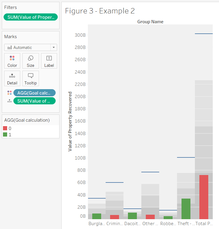
We can see that four groups have met the goal while three have not. The total recovery is a little short of reaching the 25% goal completion milestone.
Thus, we can see how powerful a bullet graph can be in revealing comparisons and helping businesses identify areas where they need more investigation, analyze different categories or analyze the performance against the goal.
These insightful visualizations were done in Tableau. Find out more about Tableau in this article.

About Techcanvass
Techcanvass is an Information Technology certifications training Organization for professionals. It offers internationally recognized certifications in the fields of Project Management and Business Analysis. It is a premier Authorized training partner of Project Management Institute (PMI), USA, and a premier Endorsed Education Provider (EEP) of International Institute of Business Analysis (IIBA), Canada.
Founded by IT professionals, Techcanvass is committed to making learning a more structured, practical and goal-oriented exercise. We also provide consulting services in the fields of Project management and Business Analysis.
Know more about our Certified Business Data Analytics (CBDA) Training, Tableau Certification program, PowerBI certification program, Data Analytics Certification with Excel programs.
We also offer IIBA Certification courses and Domain Certification Courses in Banking, Payments, Trade Finance, Insurance and US Healthcare.
Techcanvass provides CBAP Course, CCBA Course, ECBA Course and Agile Analysis Certification (AAC) Course.
Our latest offerings: PMP Certification Training and Product Ownership Analysis Training (IIBA CPOA)
